Making dense tables easier to investigate
Sept 2026 • Case Study
When investigating a question like “Why did these payments fail?”, an engineer may be working through tens of thousands of records from database tables whose schema the interface cannot assume in advance. Fast, precise navigation becomes essential.
Over ~3 months, I rebuilt our table component in a prototype sandbox, using the grid shipping in the product as a baseline.
This work was done at VuNet Systems, for vuSmartMaps: a business observability platform used primarily by financial institutions to connect IT to business impact.
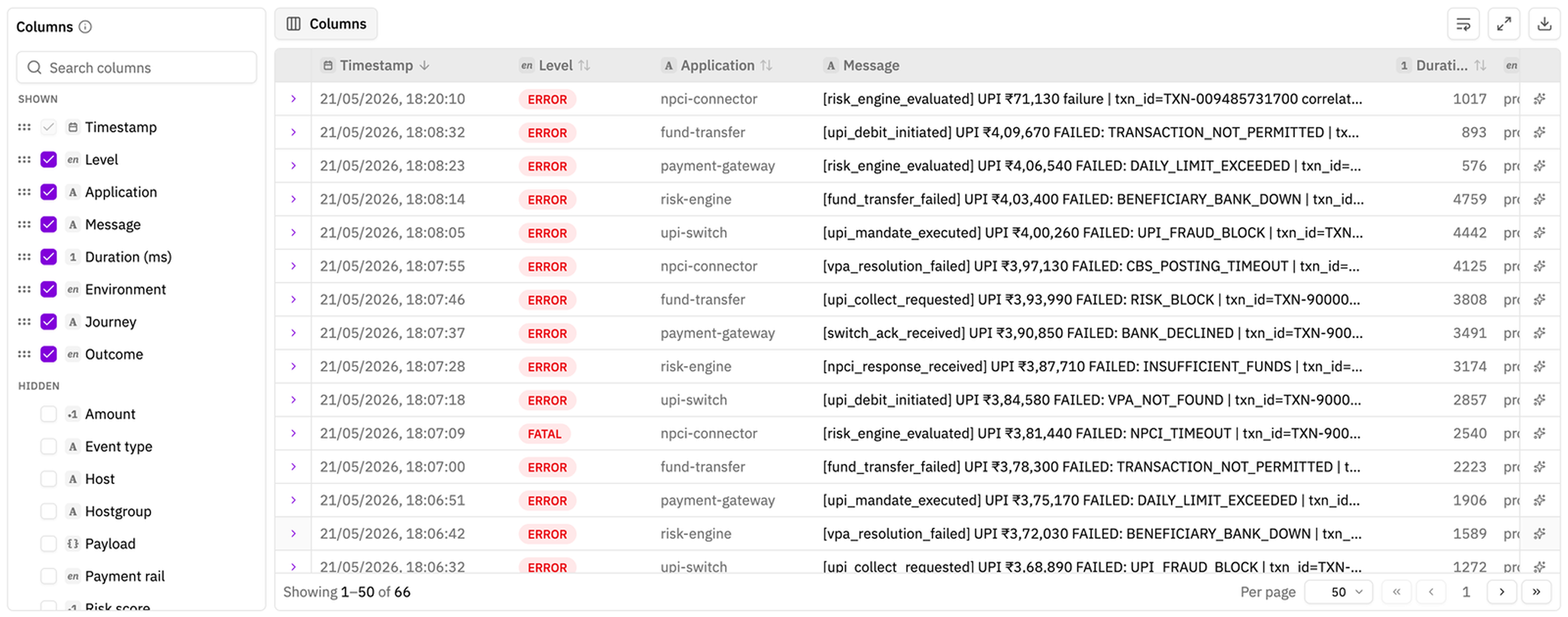
What the table needs to do
Investigating a large, unfamiliar log dataset involves three jobs. The table has to support each without making the others harder:
- Scan: read enough rows quickly to spot a pattern.
- Locate: find the relevant field among dozens of candidates.
- Stay oriented: shape a useful layout without losing context as the investigation moves forward.
Not every change described here was specific to logs. Stable column widths, pinned fields, less visual clutter, and feedback that shows what changed would improve any dense table.
The rest came from Data Explorer’s specific challenge: people often open a large dataset without knowing which fields it contains. They need to explore those fields, keep track of the record they’re investigating, and see the complete record even when only a few columns are visible.
The starting point
The current table in production was easy to scan with its four default columns. More than twenty other fields sat in one alphabetical checklist. Every header permanently showed a drag handle, and the dark header drew more attention than the records.
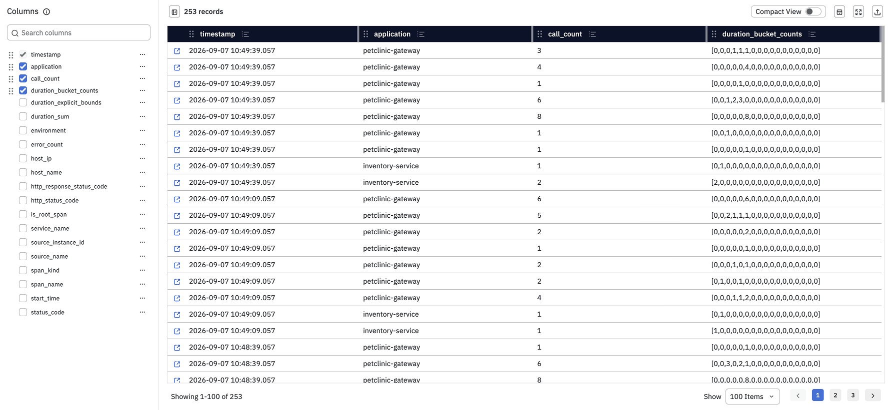
The problems became clearer as soon as someone changed this view. The sections below follow those actions one at a time.
Let columns keep their width
In the current table, adding a field squeezed every column already on screen. Timestamps wrapped, rows grew taller, and headers and values were cut off. After enough additions, the table started scrolling horizontally.
In the redesign, each column keeps its width. A new field makes the table wider without shrinking the existing ones. The table scrolls to the field and flashes its header so its location is clear.
Resizing had the same problem. Widening one column narrowed its neighbours, and a field could be collapsed until it disappeared.
In the redesign, resizing pushes neighbouring columns aside rather than shrinking them. Each column also has a sensible minimum and maximum width, so it cannot collapse or grow without limit. The resize handle is wider, and hovering over a header reveals the column’s edges, making it clear which column will change.
One rule fixes both problems: width belongs to the column, not the available screen space.
Keep important columns in view
Horizontal scrolling creates another problem: important context can leave the screen. The redesign lets people pin columns to either edge of the table.
Pinning moves a column to a fixed group at either edge of the table, and the sidebar updates to match. Pinning left moves it to the group at the start of the table; pinning right moves it beside the row actions. Unpinning returns the column to its previous place among the unpinned columns.
Keep the anchor in reach
Related Records shows events around the record an engineer opened. That record is the anchor. Everything in this view is relative to it, so it must stay easy to find.
Rows have three levels of emphasis:
- Anchor: a purple background, full outline, and anchor icon. It is the strongest state.
- Viewed: the row open in the drawer gets a muted grey background and left accent.
- Everything else: plain, with a background on hover.
If the anchor is also the open row, the anchor style wins. Its outline does not affect the row’s size, and the same background continues across pinned cells.
When the anchor scrolls off screen, a small indicator appears at the nearest edge and points towards it. Clicking the indicator brings the anchor back to the centre. It disappears once the anchor is visible again.
Pinning preserves context while scrolling horizontally. The anchor indicator does the same while scrolling vertically.
The sidebar becomes a field browser
The current sidebar mixed visible and hidden fields in one list.
The redesign separates the list into Shown and Hidden. Shown fields follow the table order; hidden fields remain alphabetical (quicker to scan). This makes it clear where fields can be reordered and where a field goes when it is shown or hidden.
Each field also has a type icon: string, enum, integer, JSON, UUID, date, and so on. The same icon appears in the table header, and hovering it reveals the exact data type. More than 30 ClickHouse types are grouped into 14 recognisable icons.
A type icon helps someone judge a field before adding it. It suggests which filters or summaries make sense and distinguishes values such as integer 200 from string "200". It also sets expectations for width and readability: UUIDs need room, enums need less, and JSON is usually easier to read in the drawer. An unexpected type can also show that incoming data was mapped incorrectly.
The current Top 5 preview expanded inside the field list and pushed everything below it down. In the redesign, it opens in a panel at the bottom, leaving the list in place. Each value includes actions to include or exclude it from the results.
A field can be previewed while it is still hidden, before someone decides to add it to the table. The preview is disabled for free text, IDs where nearly every value is unique, and raw numbers, where a top-five list would be misleading.
Show controls only when they are needed
The wider resize handle is part of a broader rule: controls appear when they become useful. Sort direction and field type stay visible because they help while reading. The drag handle and menu appear on hover, when someone is about to rearrange the table.
The menu keeps actions with the column they affect: pin left, pin right, filter, filter for non-empty values, and hide.
Use motion as feedback
In the current sidebar, reordering a field gave no confirmation. A drag could also enter the hidden fields, where the drop was ignored without explanation. In the redesign, the sidebar row highlights after a successful drop and the matching table header flashes.
Five animations give consistent feedback:
| Motion | Means |
|---|---|
| Splash: highlight a sidebar row | The action succeeded here |
| Flash: highlight a table header | The affected column is here |
| Travel: move across the grid | The column became pinned or unpinned |
| Pulse: fade in and out | The change is being saved |
| Shake: move side to side in red | The change failed |
Only pinning uses the travel animation. Pinning changes a column from scrolling to fixed, so showing where it moves is useful. Reordering only changes position, which the final layout already makes clear. Animating every cell during a reorder made the grid feel unstable.
Showing a new column scrolls it into view because otherwise the result is hidden. Reordering does not scroll the table; someone may make several changes in a row, and repeated scrolling would make the table harder to follow.
Show failures where they happen
To test a save failure, one field in the prototype always fails when its new order is saved. The feedback stays attached to that field before a toast explains what happened.
The sequence is:
- Pulse while the change is being saved.
- Shake in red where the field was dropped.
- Move back to the previous position.
- Show a toast with the reason.
Success animations now run only after the change is saved. Otherwise the table would confirm an action and then undo it, making future feedback harder to trust.
Show the complete record
In the current product, the drawer shows only the fields selected as visible columns. Hiding a field from the table also hides it from the record details.
The redesign shows every parsed field, plus the original raw record, regardless of the visible columns. Column visibility now controls the table view, not access to the record.
Fields are grouped into Core and Scope, and search works across keys and values.
Previous and next controls, plus keyboard shortcuts, move through records without closing the drawer; the speed allows for smoother discovery of the relevant record. The table stays visible behind it, with the open row highlighted. This keeps the current record in context while someone moves through the results.
Make wrapping explicit
The current switch is labelled Compact View, but it actually controls line wrapping.
The redesign uses a wrap icon with a clear active state. Off keeps each row to one truncated line; on shows the full message and lets the row grow.
Decisions and trade-offs
- Keep dragging within a pin group: dragging reorders a column within its current group. To move it from one pinned edge to the other, unpin it first, then pin it to the other side.
- Do not animate the whole table on reorder: the final position already shows what changed.
- Scroll when showing, not reordering: a newly shown field must be revealed. Reordering may happen several times, so scrolling the table after every change would be disruptive.
- Disable misleading summaries: top-five results are not useful for free text, UUIDs, or raw numbers, so the control explains why it is unavailable.
What changed
The redesign makes the table’s three jobs support one another:
- Scan: stable widths, quieter headers, and explicit wrapping keep rows readable.
- Locate: field types, useful previews, and a complete drawer make unfamiliar data easier to explore.
- Stay oriented: pinned columns and the anchor indicator preserve context while scrolling.
The prototype has since been handed over to Engineering. It now provides clear interaction rules for a production implementation.