Klimate Kundli
Jul 2026 • Case Study
Klimate Kundli is an interactive exhibit that generates a takeaway, personalised climate horoscope based on a visitor’s inputs of their birth year and the places they have lived.
Built for Data, Otherwise, VizChitra 2026's exhibition on climate & ecological change, which opened 3 July 2026 at Bangalore International Centre.
The public version lives at klimatekundli.com.
This article has been co-written by Nithya & Arko.
This project seeks to reframe climate data away from abstraction and toward memory, place, and everyday life by inviting visitors to encounter and reflect on their data as personal and generational climate experiences.
A Klimate Kundli simulates the act of interpreting a birth chart by an astrologer through data visualisations of climate change that visitors have likely lived through and also suggests some remedies, inviting reflections on the gap between personal gestures and planetary-scale climate action.
How it all began
Klimate Kundli was, quite literally, born from an act of whimsical wordplay. The alliteration was catchy. The concept of a personalised birth chart climate chart sounded extremely apt. And so Nithya’s suggestion struck an immediate and lasting chord with both of us!
A kundli is a twelve-house chart of where the planets sat when you were born. It is supposedly a map of your fate. A klimate kundli relies on climate signals, instead: the temperature you were born into, what your monsoon has done since, how far the sea has come up. We chalk up a very similar chart for you, that helps visualise the climate that you’ve lived through.
How a kundli gets made
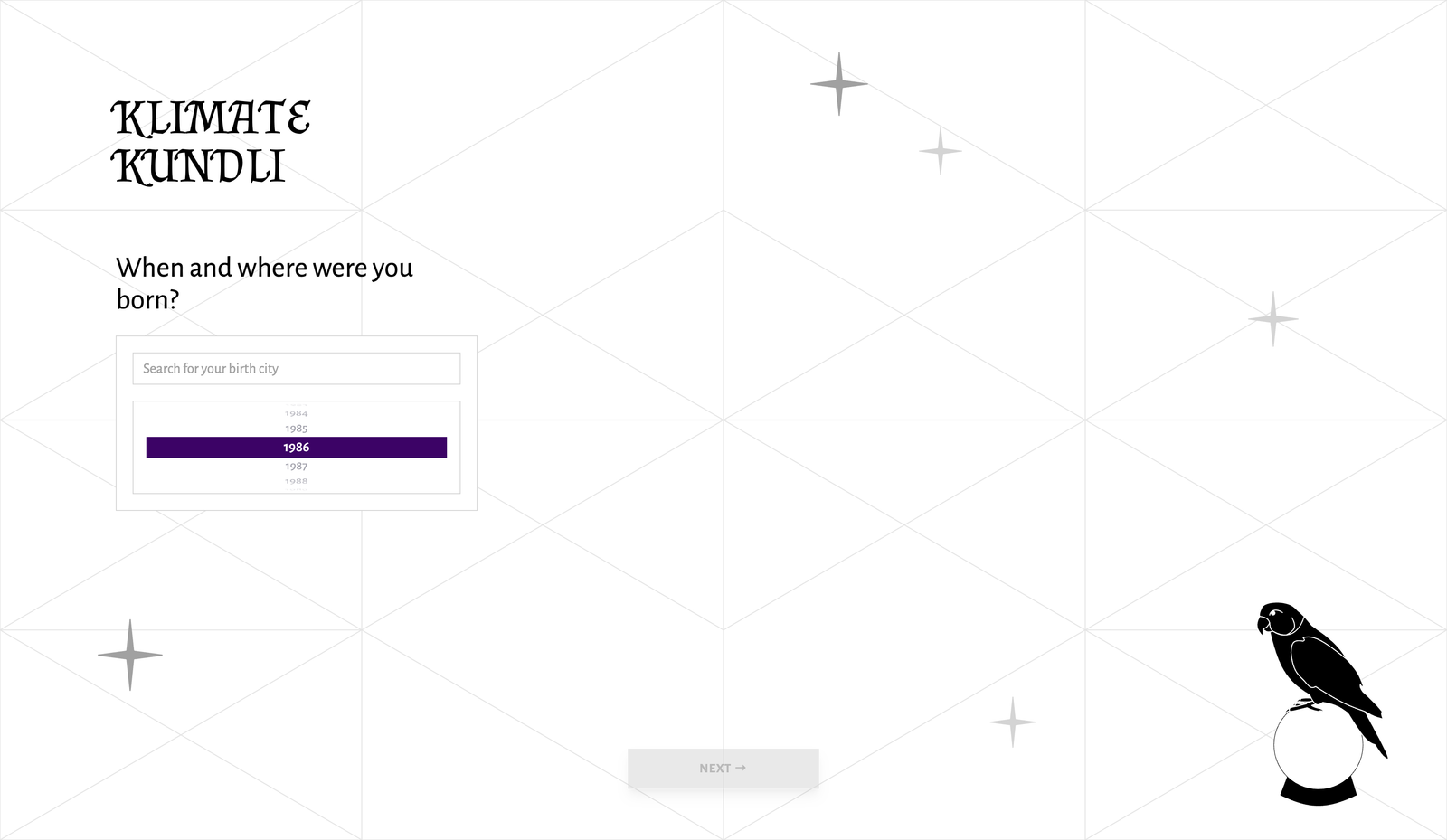
A visitor hands over three things: their birth city, their birth year, and everywhere they have lived since.
Nobody recalls their moves as dates, they recall them as stretches. So that screen is a timeline instead of a form, and each city is a bar you shorten to make room for the next one.
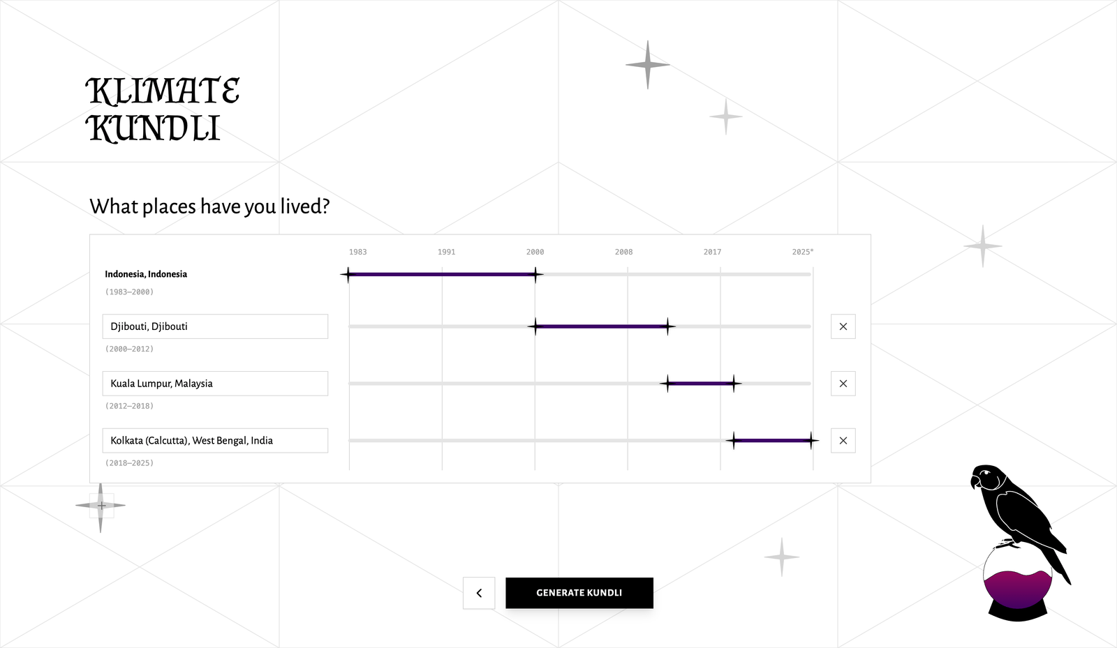
The add button stays disabled until you do. There is no room on the timeline for a second city while the first one runs to the present day, and the tooltip says so rather than letting you click into an error you then have to undo.
Building it three times
Our goal, from the very beginning, was to keep things personal. We absolutely wanted the kundli to reflect a person’s felt experiences (across all the places that they’ve lived in or passed through). Another non-negotiable was for this to be available online, to a larger audience. That meant Klimate Kundli (henceforth KK) would have to cater to people who might have been born anywhere on Earth. And in the context of the exhibition space, we also had to account for unreliable network: these two constraints decided most of our engineering architecture.
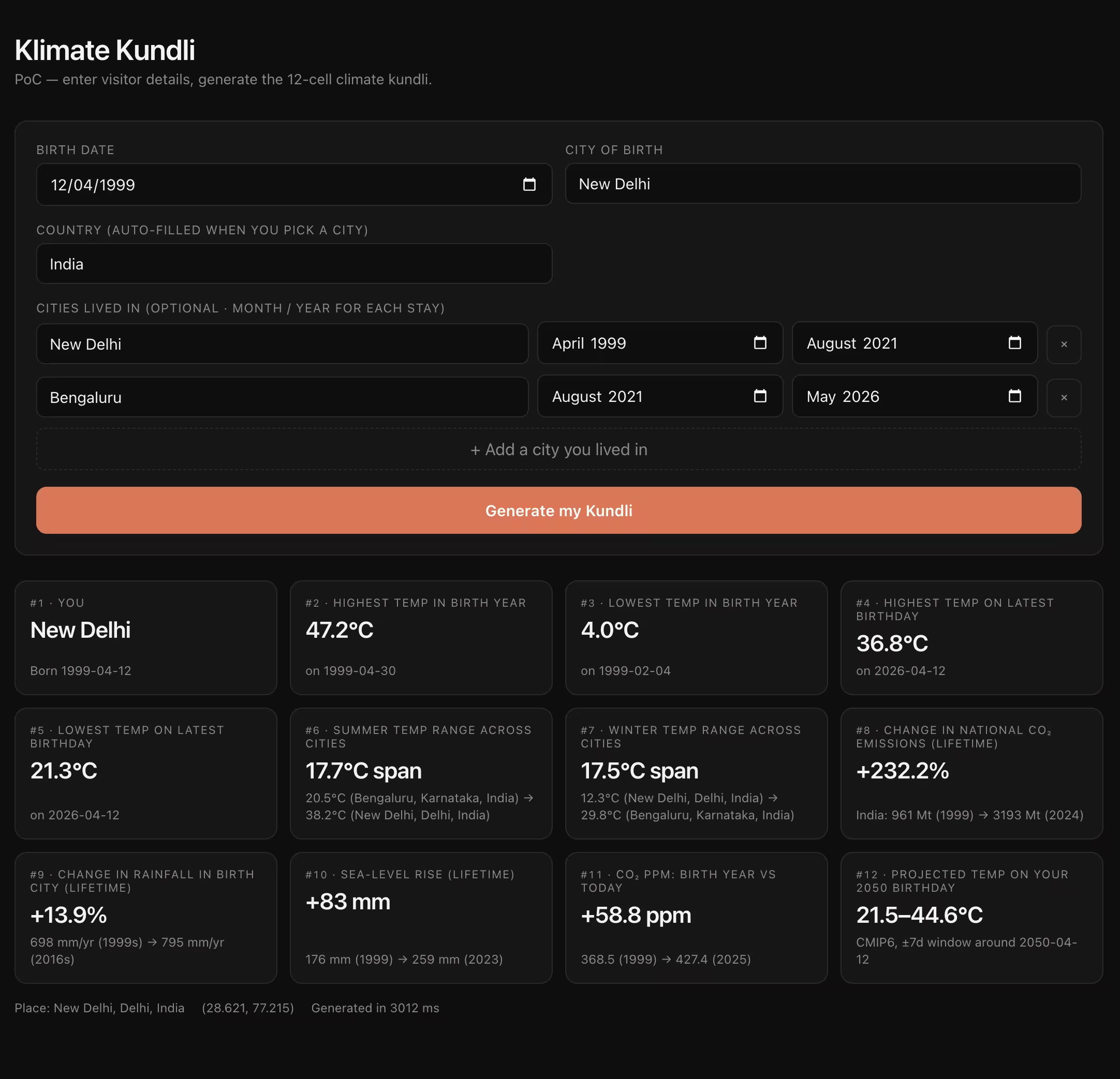
So, naturally, before we could make data visceral, we had to figure out what kind of data we’d be working with. Version 0.1 was a localhost proof of concept: a single-page form that called Open-Meteo live and rendered twelve cells. It validated the card mapping and confirmed one API could cover any birth city in the world. It looked like a developer tool, though.
Version 0.2 was a lesson in avoidable-engineering-overhead. Due to API rate-limits, calling them at read time was fragile. I tried to own the data plane: a Python ingest CLI pulling Copernicus ERA5 and the India Meteorological Department’s gridded rainfall back to 1901, raw artifacts in Cloudflare R2, and aggregates in Postgres. The idea was for KK to never touch an upstream API. It worked end-to-end, but, paying ingest and ops costs to reproduce what Open-Meteo already serves at scale ultimately felt wasteful.
Version 0.3 cracked the data pipeline: a thin Hono server with a SQLite cache, fallback chains (ERA5, then NASA POWER, then the nearest pre-warmed city), and graceful partial responses when a source times out.
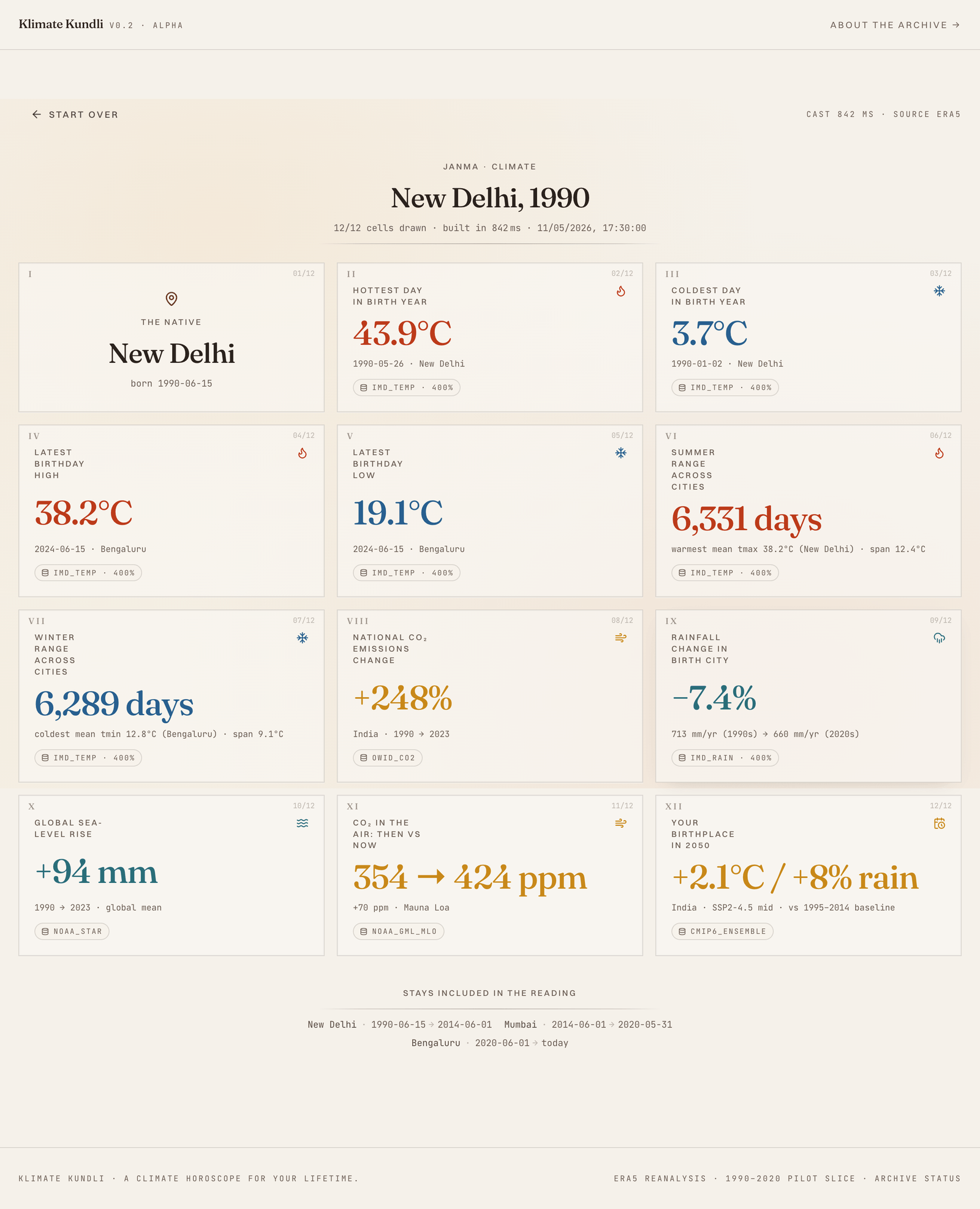
In the midst of figuring out our tech, we were slowly beginning to try out different graphic design flavours for the web experience. We briefly experimented with a parchment-esque vibe.
The reading
When one thinks of climate, one imagines studying an amalgamation of temperature, rainfall, and emissions data.
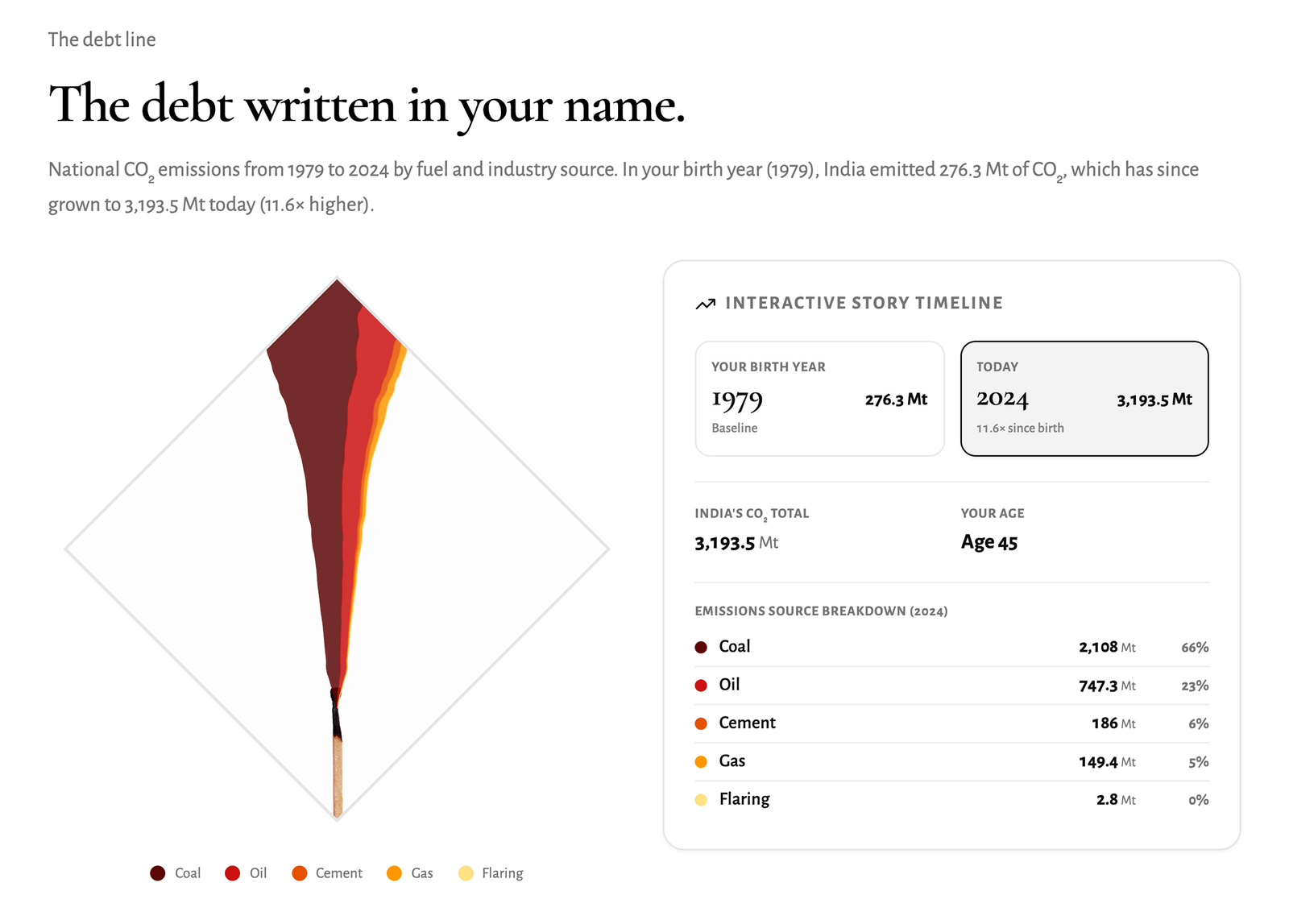
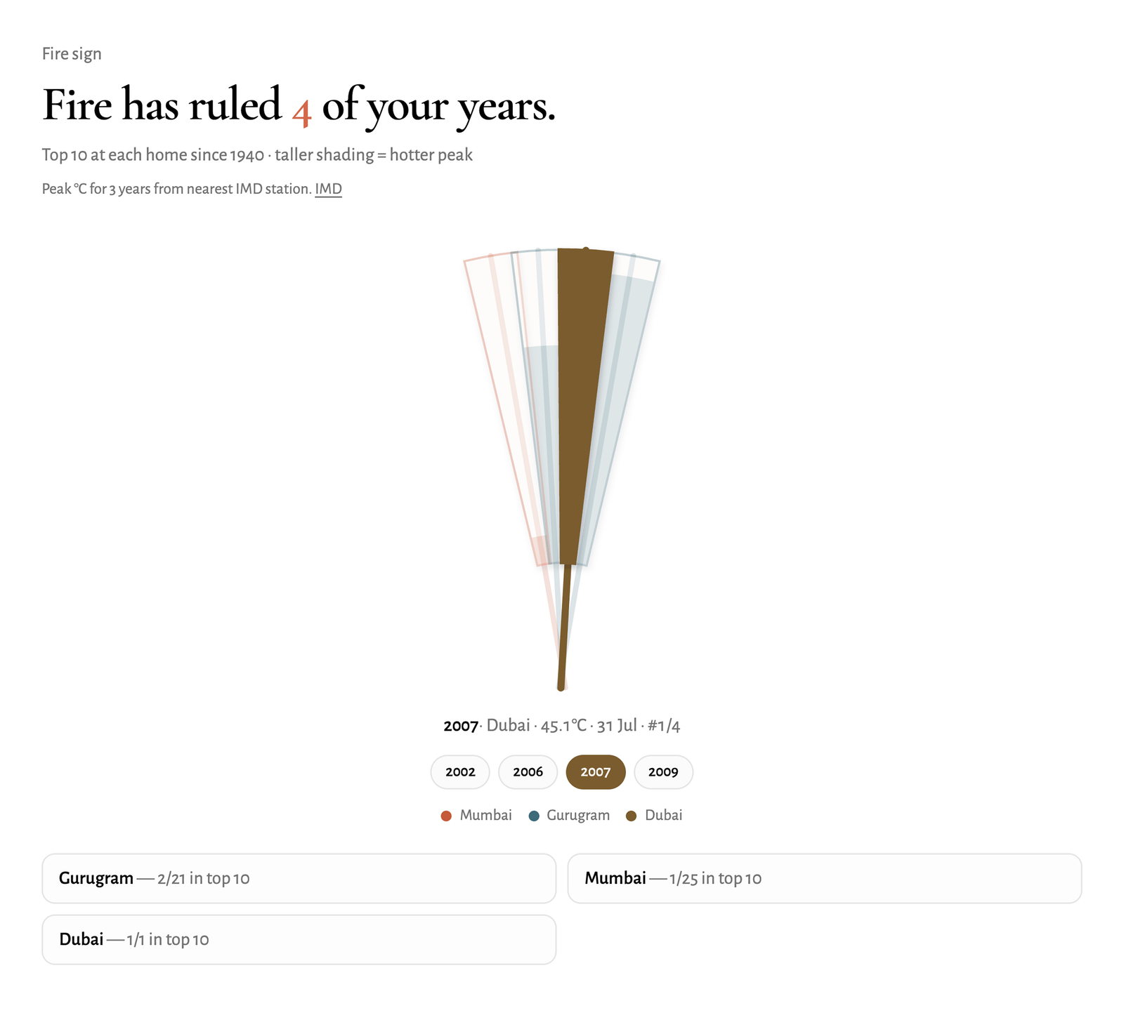
Each card speaks in the voice of a kundli: the monsoon rewrote your fate line, fire ruled seven of your years; and each line sits on a real number from a public record. Temperature and monsoon rainfall both come from the ERA5 reanalysis back to 1940, national emissions from Our World in Data, atmospheric CO₂ from Mauna Loa, sea level from a NOAA/CSIRO reconstruction, and the record-hot-year peaks from IMD station records for Indian cities near a station, ERA5 everywhere else. Every card carries its source and a confidence label.
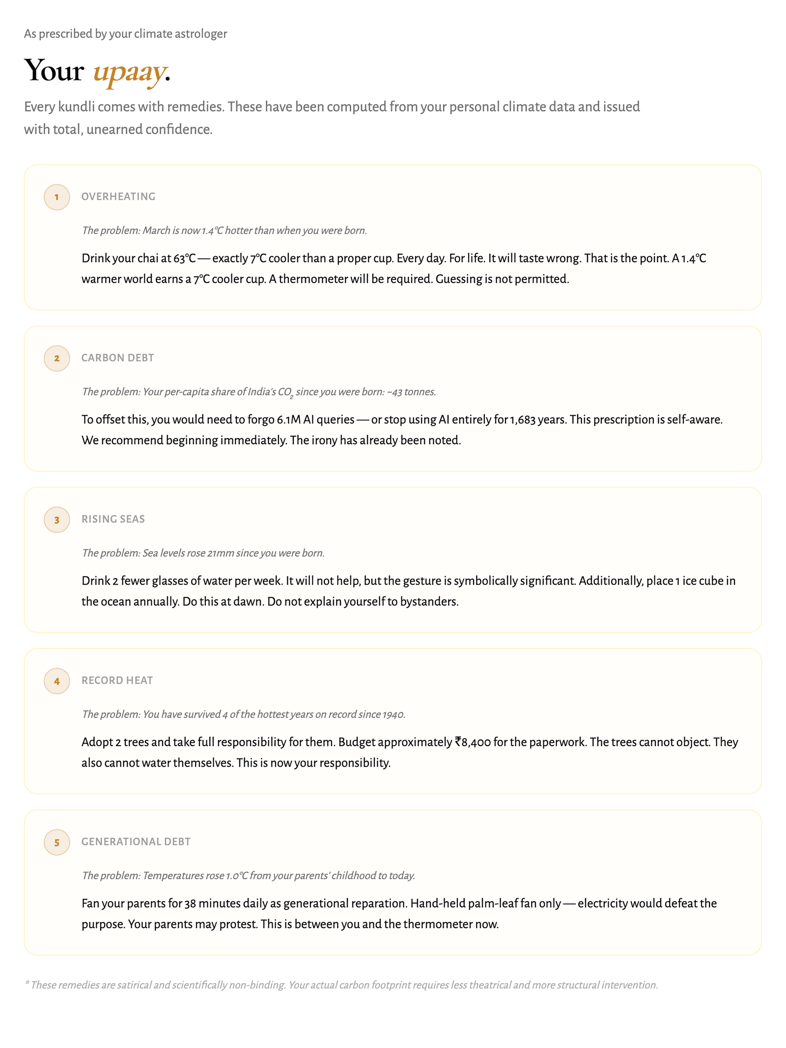
The reading ends the way a real one does, with upaay: remedies. Drink your chai two degrees cooler for the rest of your life. Forgo a few million AI queries to settle your carbon account. They are jokes and the card admits it.
Finding the right visualisations
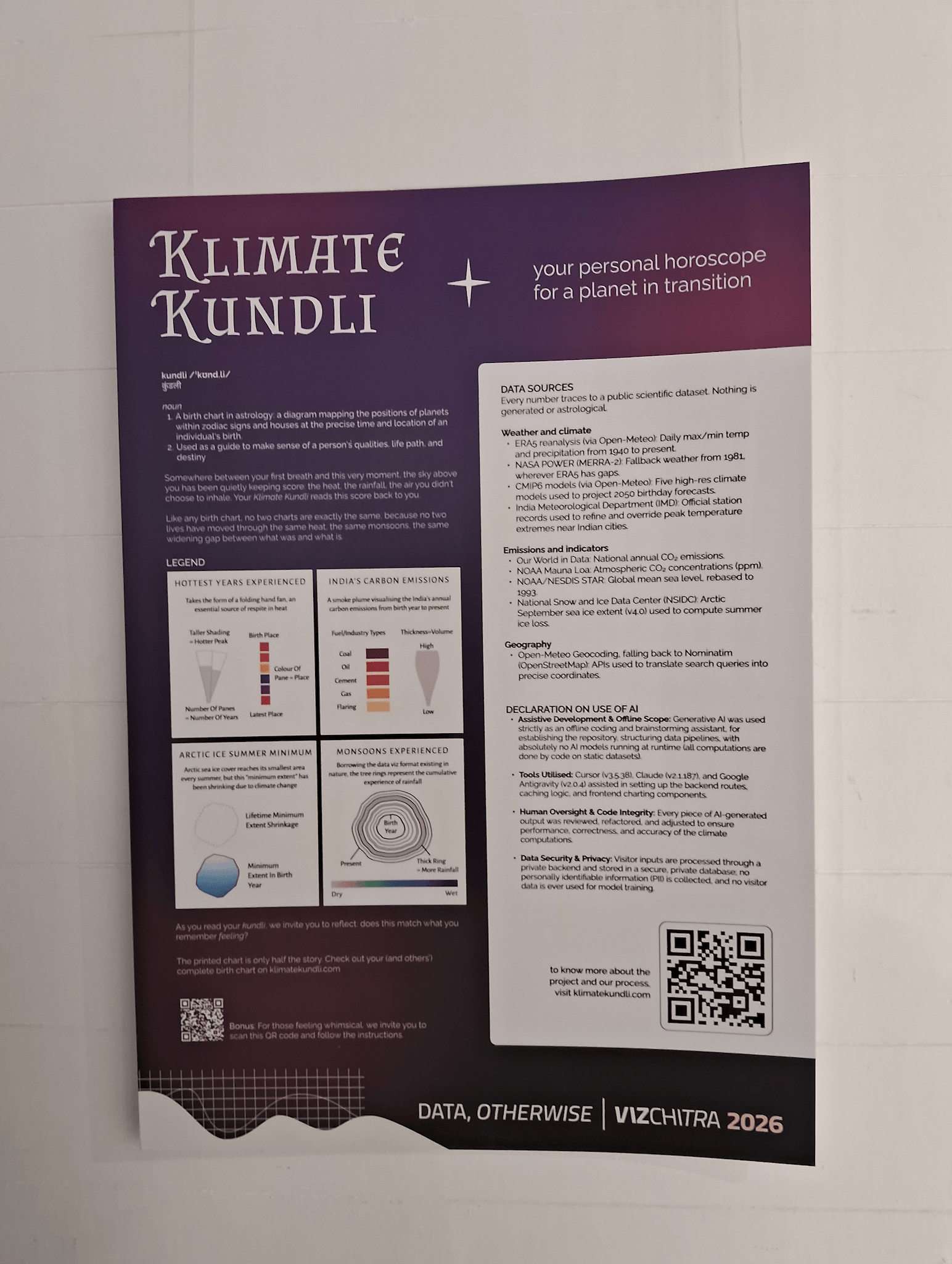
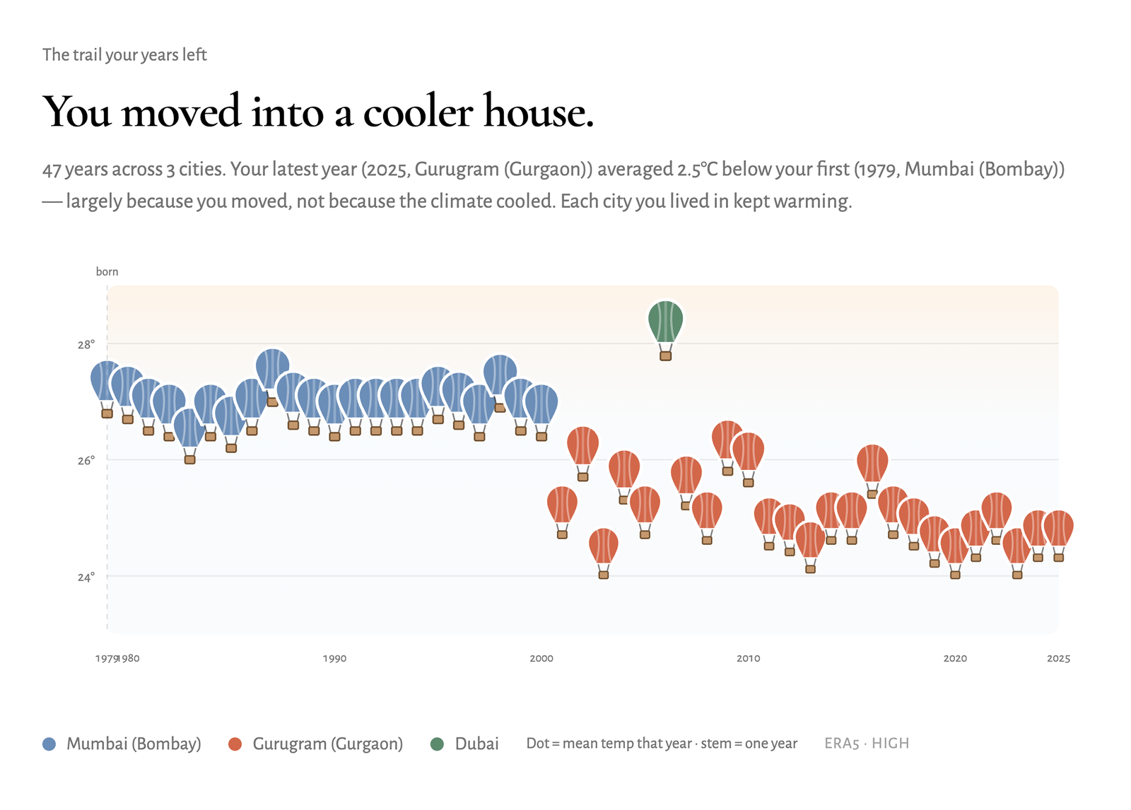
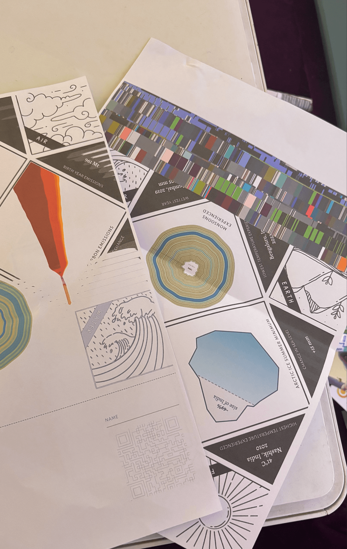
The data model froze early; the charts never did. The lifetime temperature trail started as dots on stems and ended as hot air balloons, altitude carrying each year’s mean. National emissions began as concentric tree rings, your lifetime beside your parents’ generation on a shared color scale. Rings became a streamgraph, and the streamgraph became a smoke plume rising off a matchstick, stacked by fuel: coal, oil, cement, gas, flaring. Record-hot years render as a hand fan, one blade for every year you lived through a city’s ten hottest since 1940.
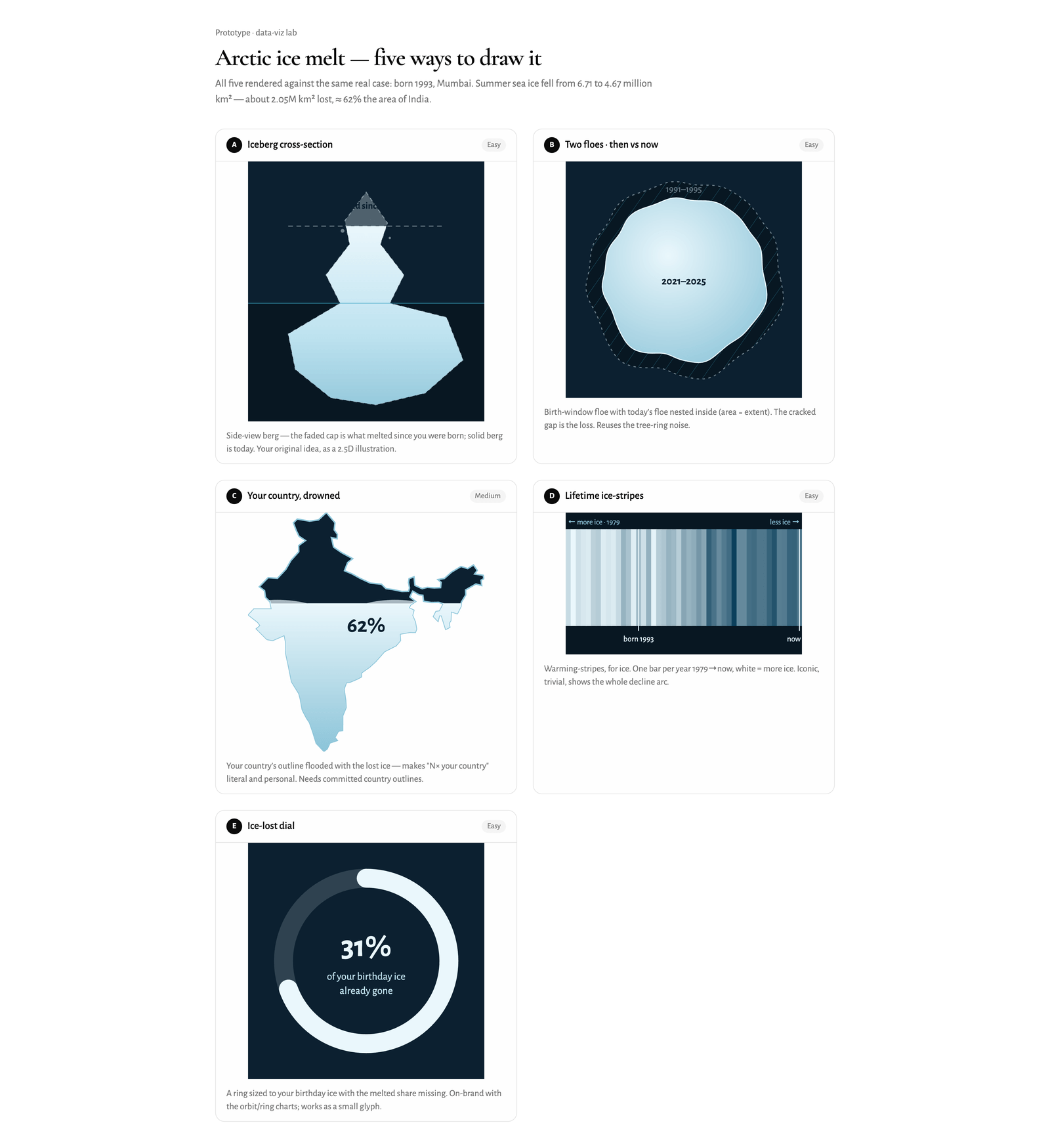
Figuring out a way to show the melting Arctic ice in the context and duration of your lifetime [so far] saw a few iterations as well:
- an iceberg cross-section
- two nested floes
- your country’s outline flooded with the equivalent lost area
- one stripe per year since 1979
- a dial with the melted sector missing
The iceberg won.
Venue engineering
Production is deliberately small: a Vite frontend on Vercel, the API on a DigitalOcean droplet under systemd, SQLite as the only database in the read path. Before opening we expanded the pre-warm cache from 35 cities to 933, so nearly every plausible birth city answers without an upstream call.
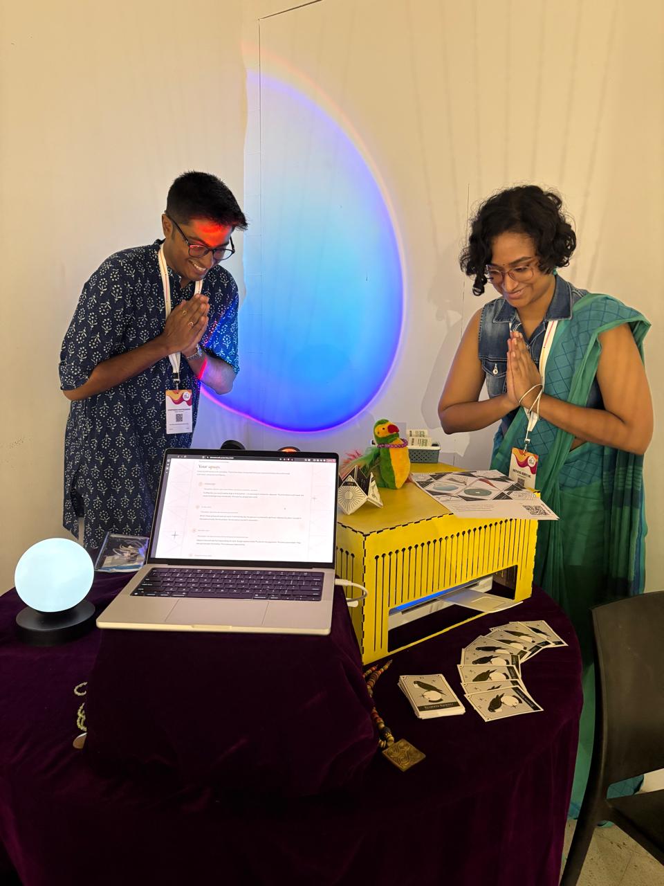
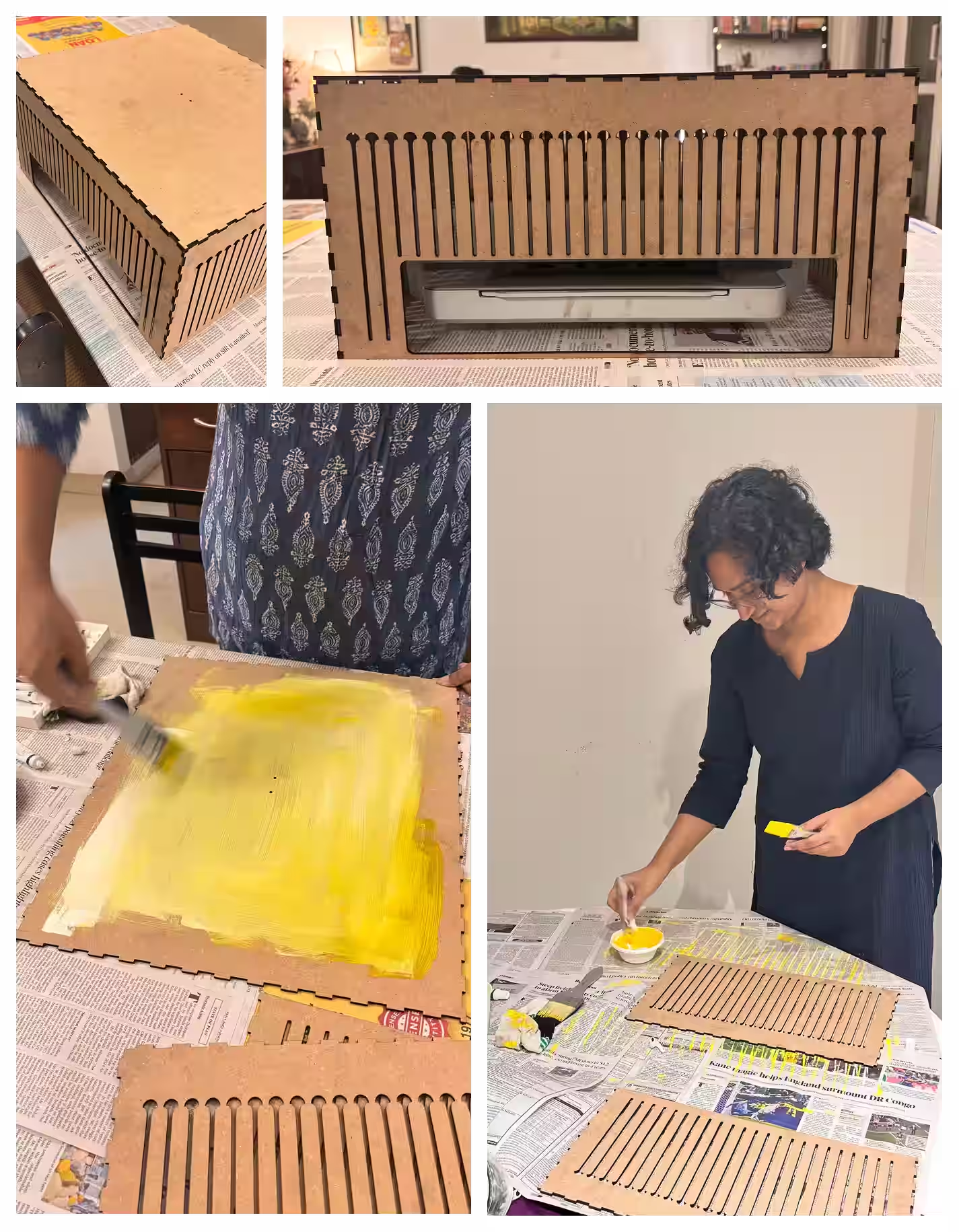
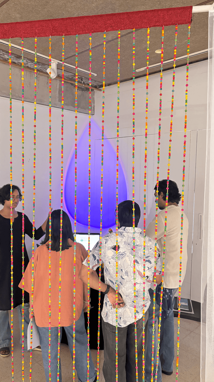
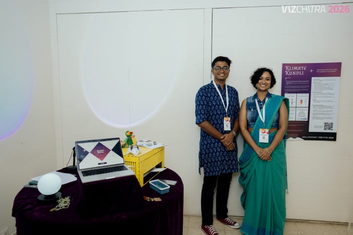
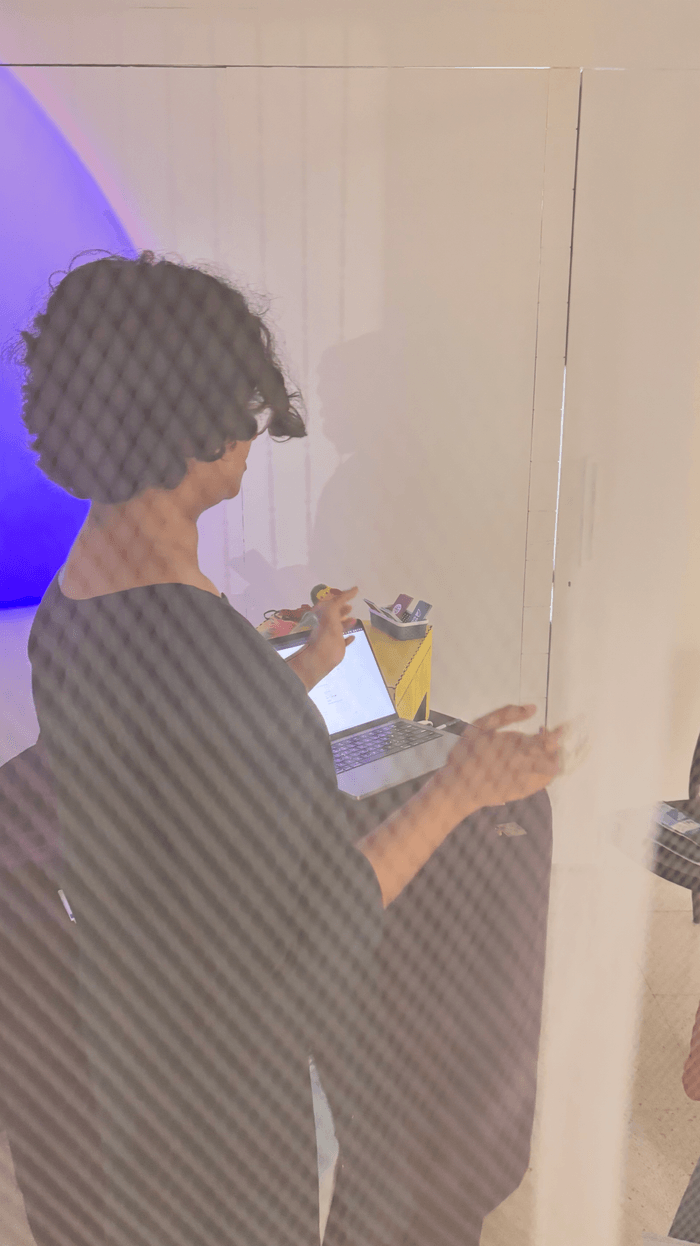
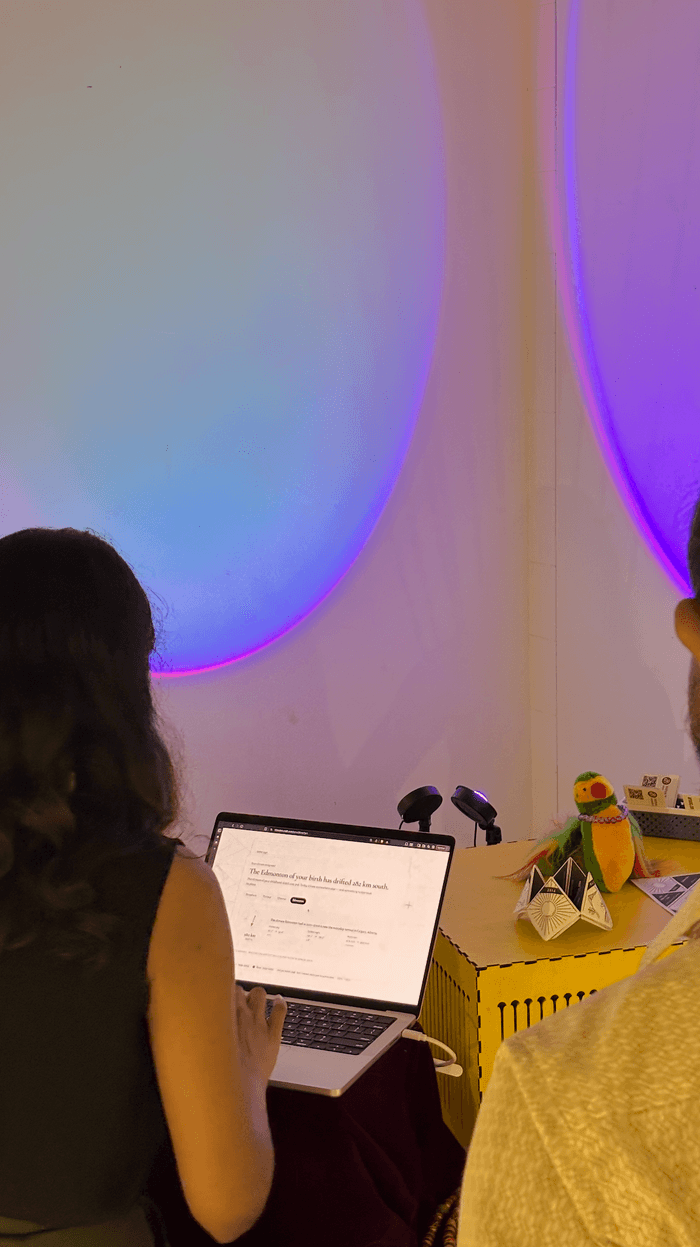
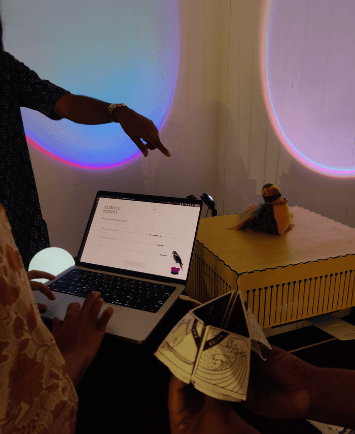
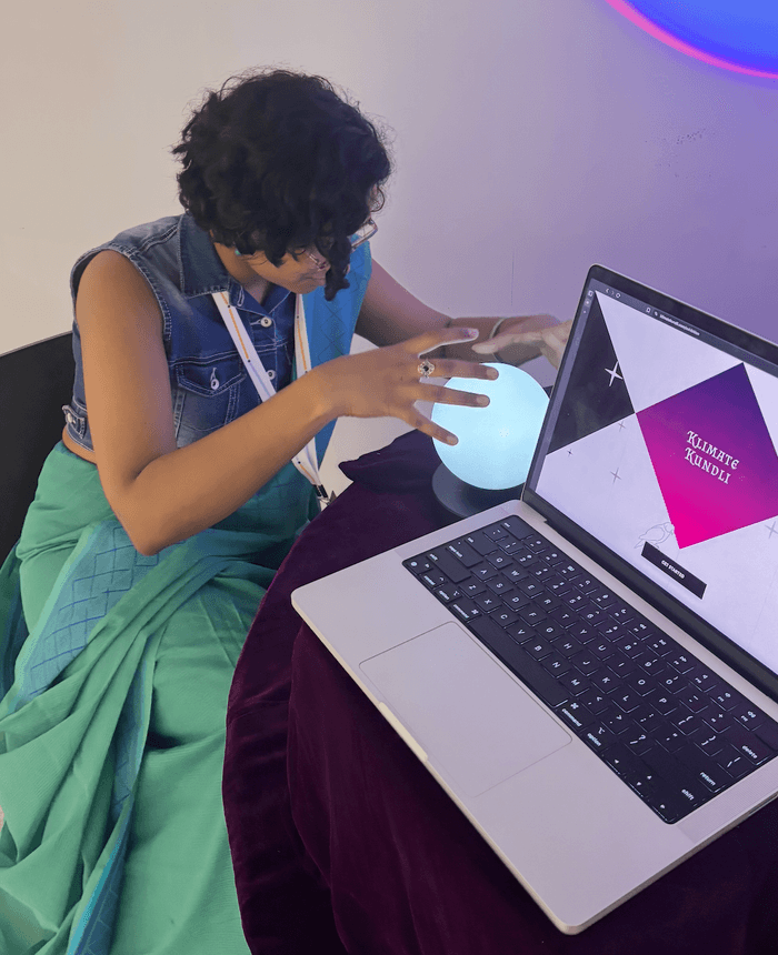
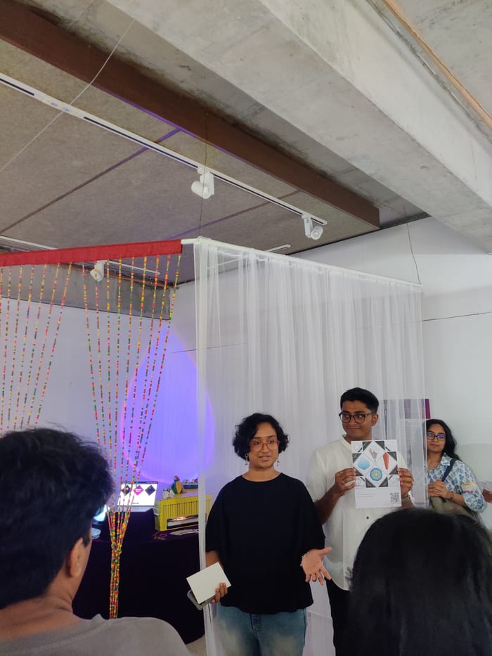
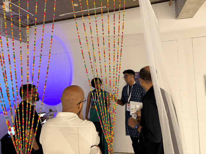
The hardware is two objects: a laptop visitors type into, and a printer that hands the kundli back. Everything around them is costume, and the costume does half the work. Nobody gives a stranger their birth details across an open table, so the booth is closed off with beaded and translucent curtains. Inside is a table under heavy velvet, the kind a jyotish works at, a crystal ball that is really a round white lamp, some paraphernalia, and Dodo, your thirty-year-old parrot astrologer. Parrot astrologers sit in grated metal cages. Dodo’s is laser-cut, painted bright yellow, and has the printer in it.
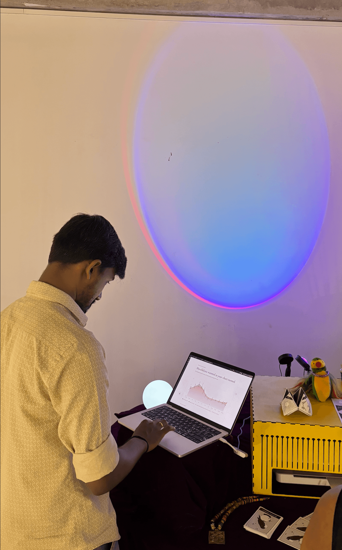
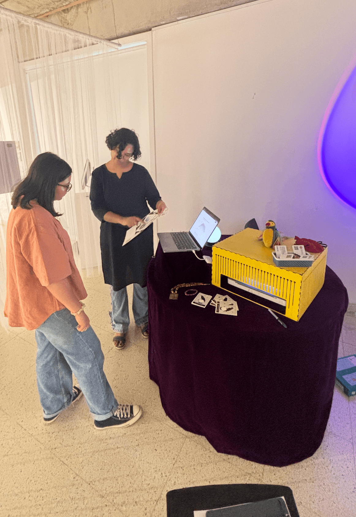
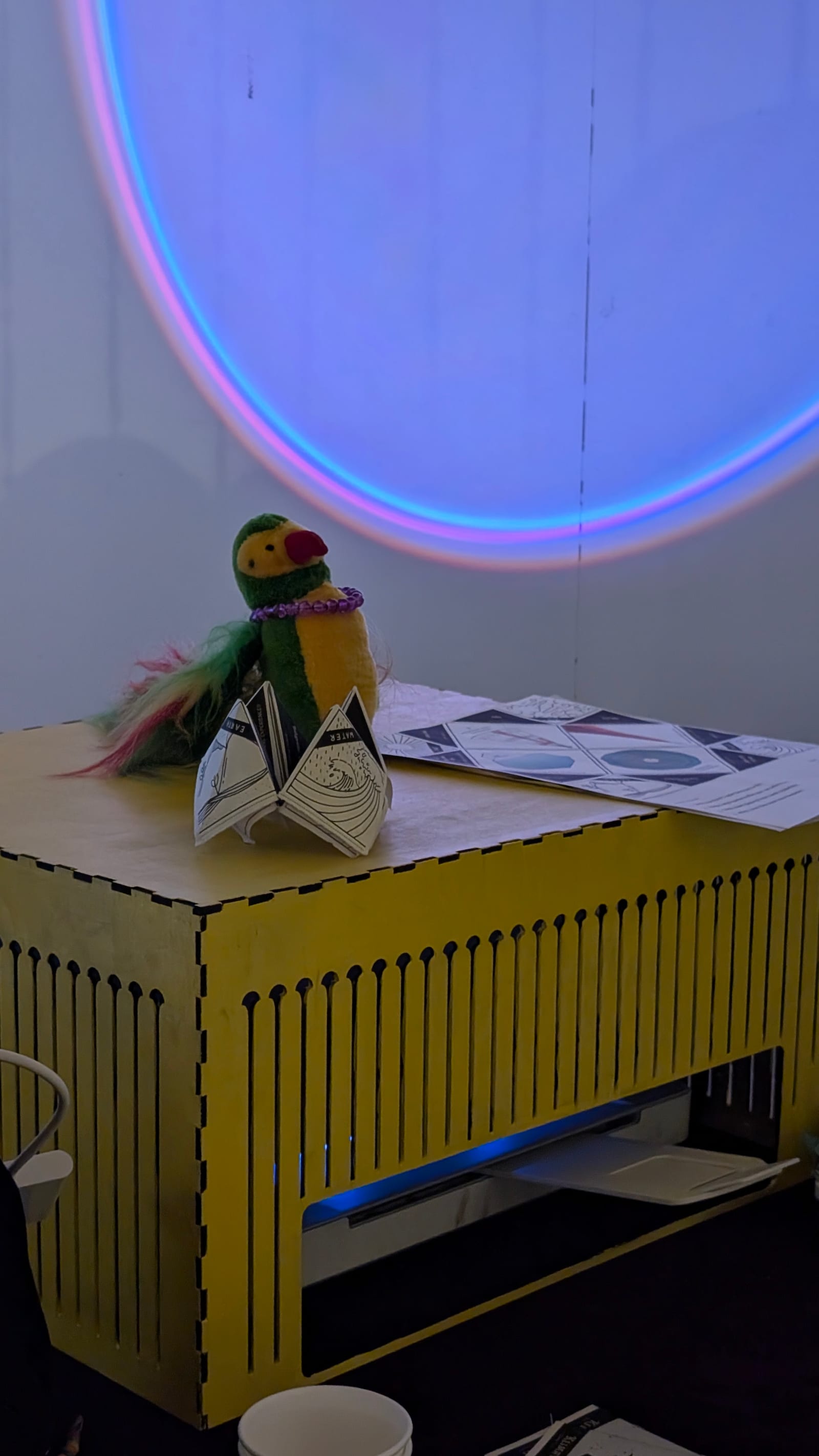
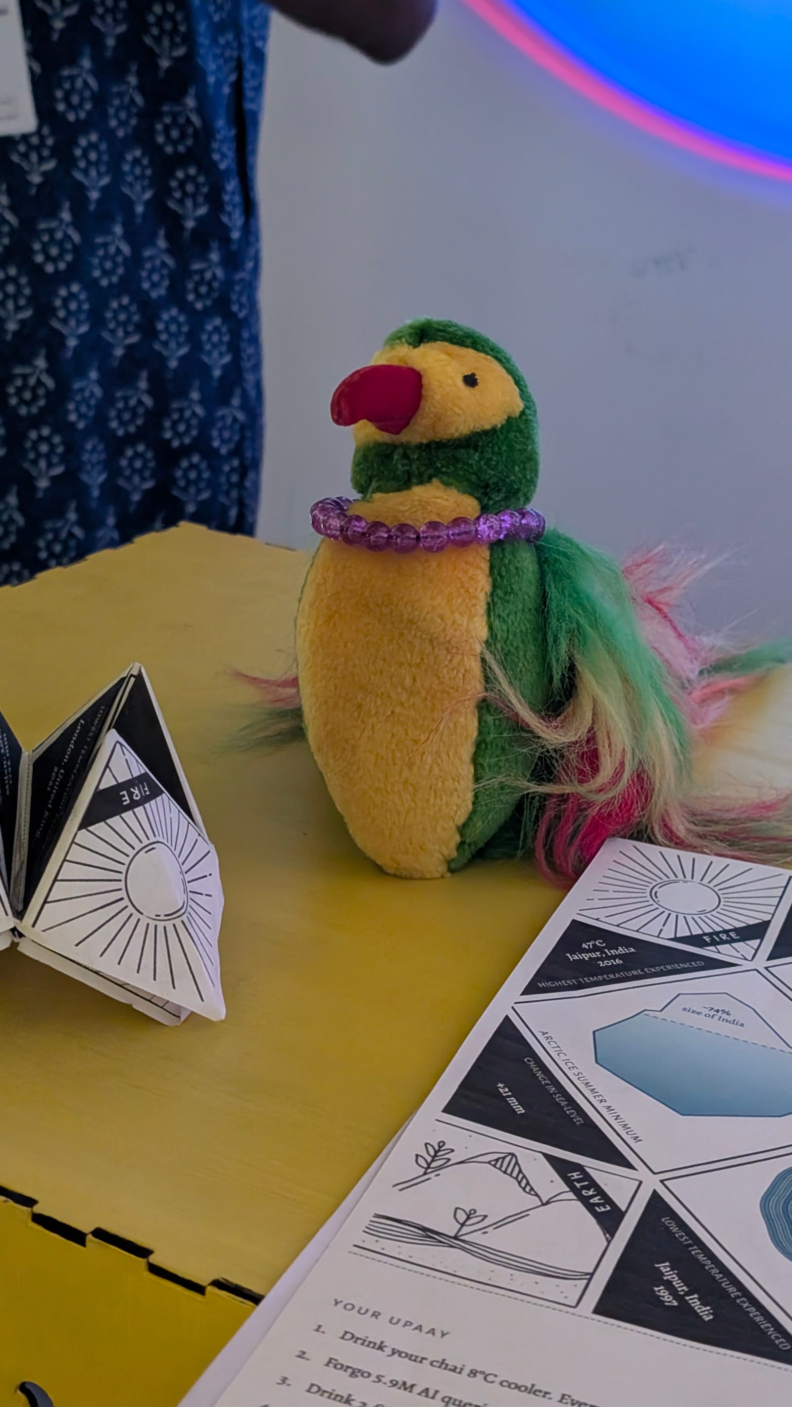
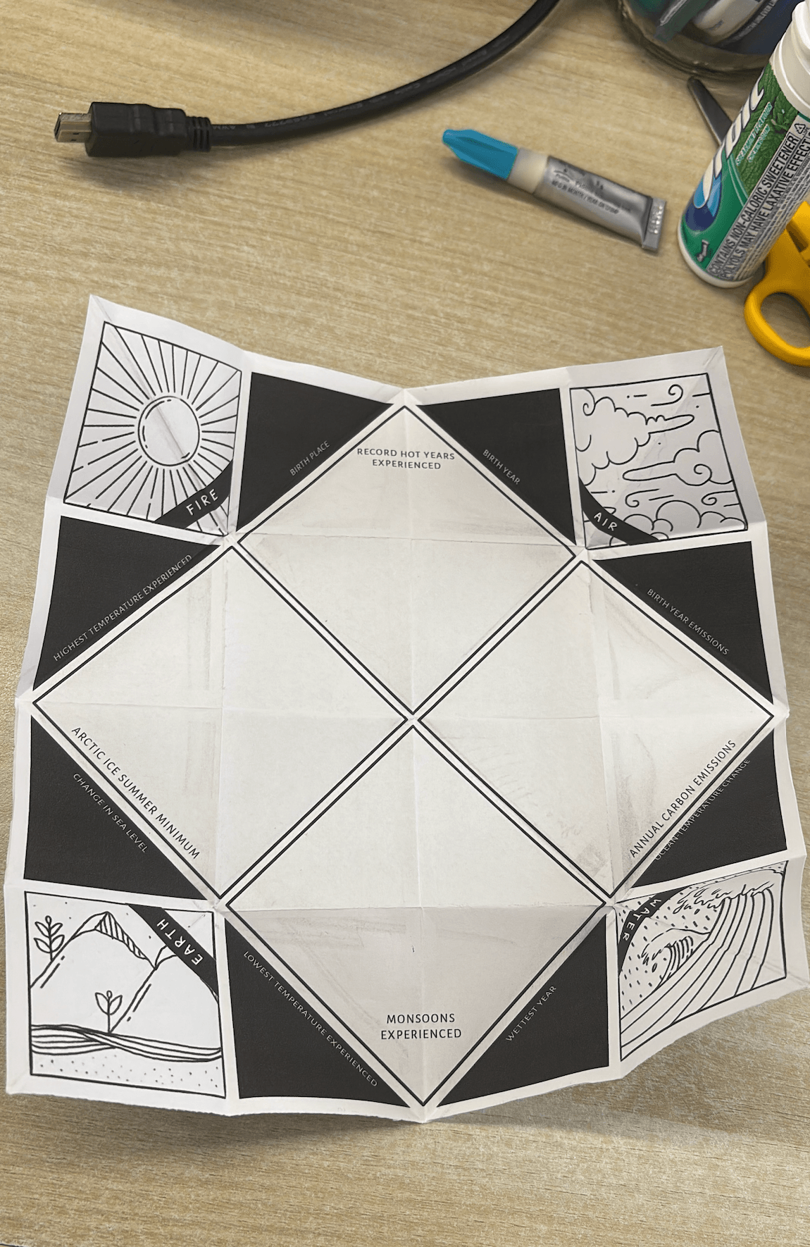
The takeaway artifact is a paper fortune teller, the cootie-catcher you folded in school, with the reading laid across its creases. Each sheet is generated per visitor: the hand fan in the top flap, monsoon tree rings merged into one chart, the iceberg with its melted cap labelled, a QR code back to the visitor’s saved reading, their name and upaay on the bottom strip. It prints as a single A4 with zero margins through a print stylesheet.
At the venue, and after
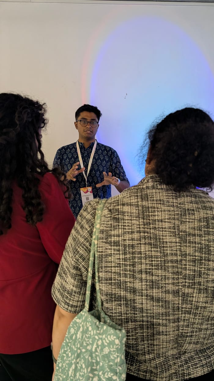
Data, Otherwise opened on 3 July. Visitors type a birthday and their cities, watch the reading assemble, and leave with the printout.
Over two days the booth produced 197 kundlis spanning 230 cities and roughly 100 million daily weather values. The pre-warmed 86-year cache answered 97% of that from disk in well under a second; only five kundlis ever needed a live API call.
The public site is the same instrument minus the printer, with a gallery of saved readings at shareable links. The week after opening I instrumented the funnel with self-hosted Umami—landing, generation, print—to see where people drop, which is where the project sits now.
What we took away
- At exhibit scale, an aggressive cache in front of someone else’s API beats all else.
- Costumes are necessary. The astrology wrapper is what makes strangers walk up, and the source labels are what let them trust what they read once they do. Neither works alone, and most of the eight weeks went into keeping both true at once.

Colophon
Curators: Debanshu Bhaumik & Siddhartha Mukherjee
Mentors: Debanshu, Siddhartha, Aditi Bhat, and Amit Kapoor
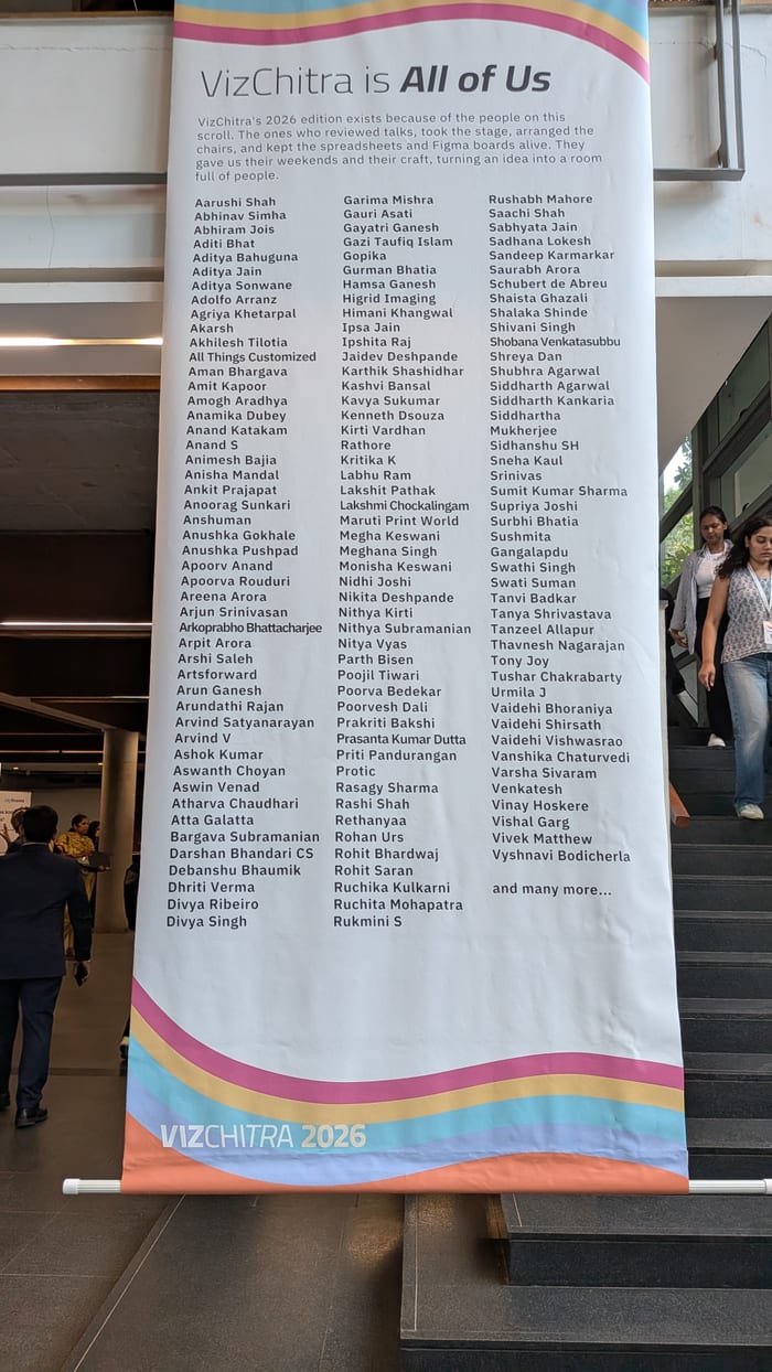
We’re eternally grateful to Debanshu & Siddhartha for being there right from the beginning, and through till the very end. Thank you for allowing us to exhibit, and for being patient with us. Being first-time data-viz’ers, the gentle nudges and quiet confidence were invaluable, as we navigated the creative and challenging space of data visualization.
Aditi, thank you so much for being a fabulous sounding board and friend. You lent a ear and hand whenever we needed it. Your help with figuring out 3D printing and laser cutting was invaluable.
Mathura, thank you for lending us the printer and your parrot (Dodo). Dodo especially, stole the show, and how! Thank you, also, for letting us hangout at PCL.
Syed bhai, your promptness and the perfect craftsmanship with the table cloth stitching was second to none. Thank you.
To the laser cutting anna at Arun CADD, thank you for your willingness to help with the printer-casing.
To Nithya and Arko: I hope we can look back at this project with a quiet sense of pride. To have pulled off something like this in the time that we did, despite having full-time jobs: is quite incredible!