Impart (formerly MAP Academy)
Feb 2025 • Case Study
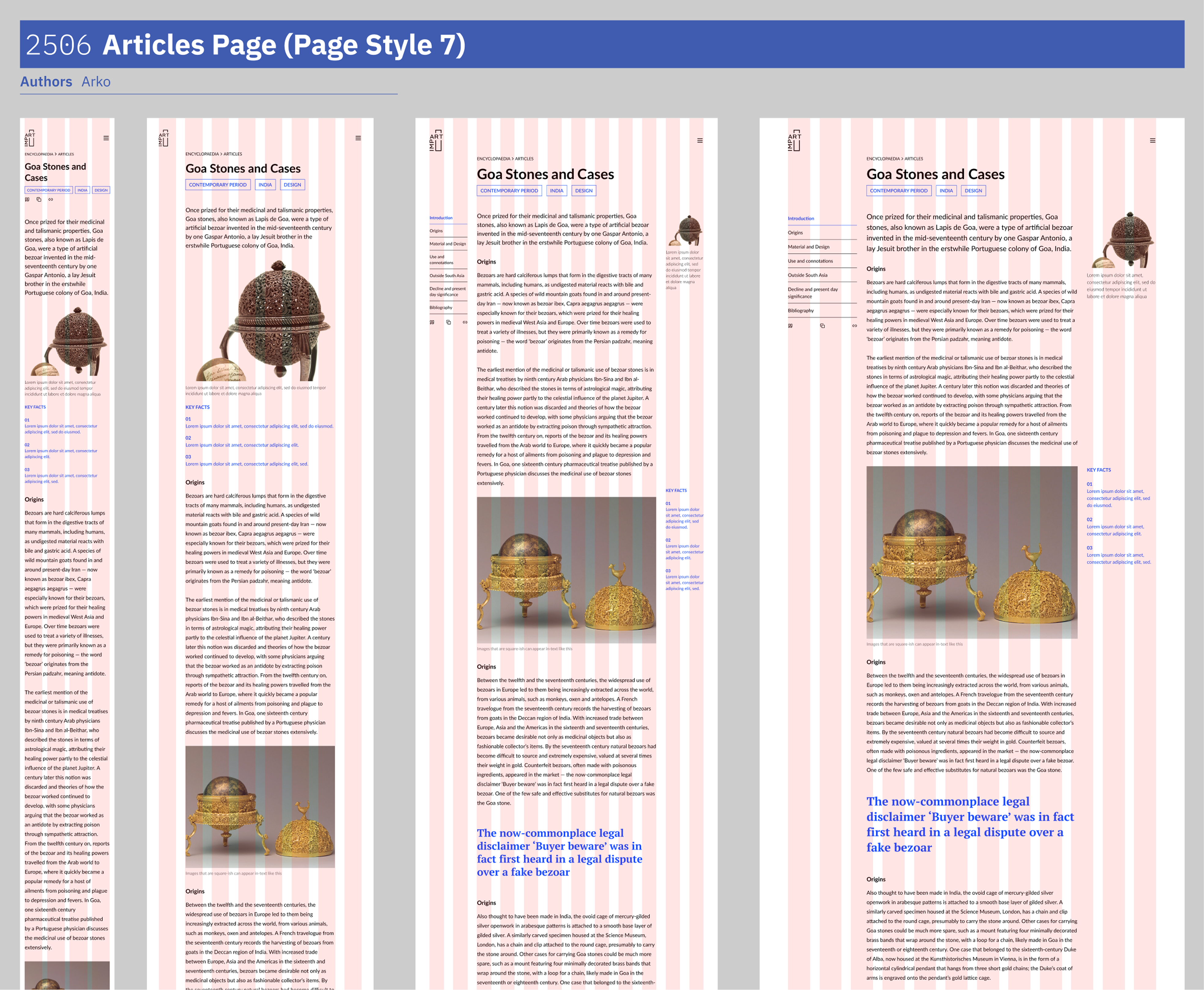
Impart (formerly MAP Academy) needed a design system that could stand the test of time—components consolidated, files legible to developers, layouts holding from phone to TV.
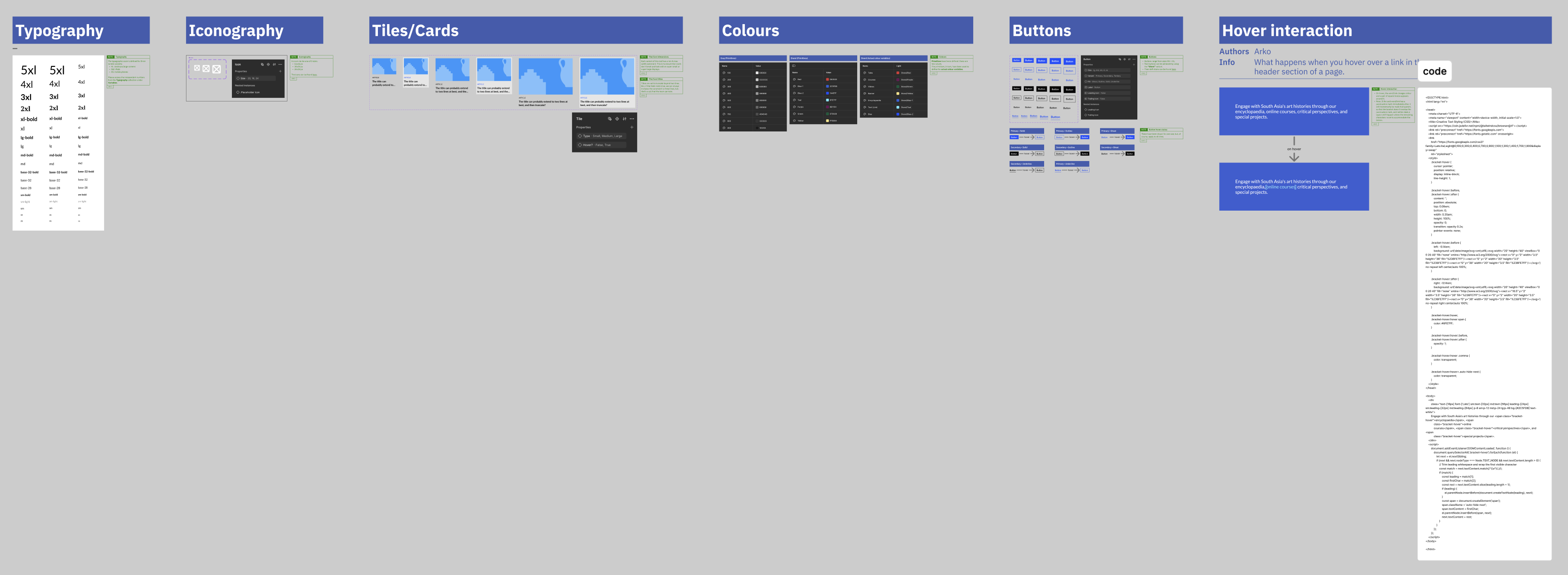
Over ~6 months with Shruti, we rebuilt from scattered local instances to 25+ annotated components ready for dev handoff.
Starting point
The first file I opened with Shruti Singh had components living as local instances: scattered across the page; none of them shared. The team wanted to start fresh: keep the visual direction, but, rebuild everything else.
Impart is image-heavy, editorial, and the new site had to hold from a phone to a TV. Every component we shipped would need to hand off cleanly to developers—not just look right in Figma.
Principles we set early
A clean slate is a chance to set discipline early. Before touching buttons or cards, I wanted two things in place: a way to document design thinking inside the file, and rules for evolving the library without breaking pages already built.
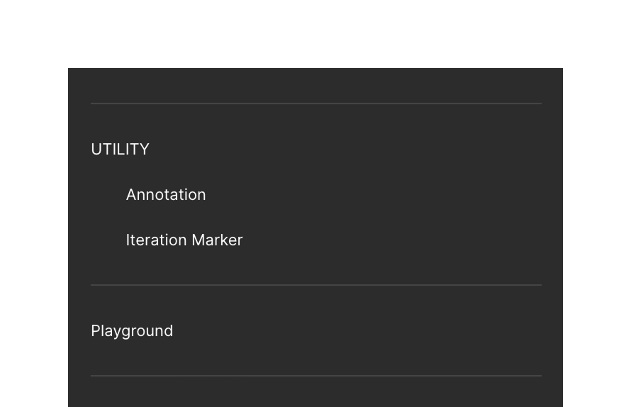
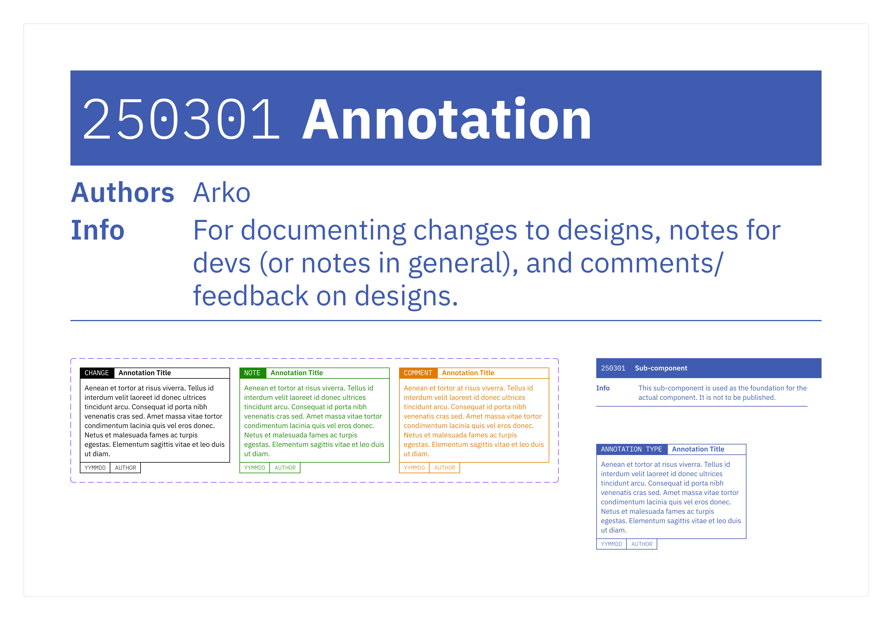
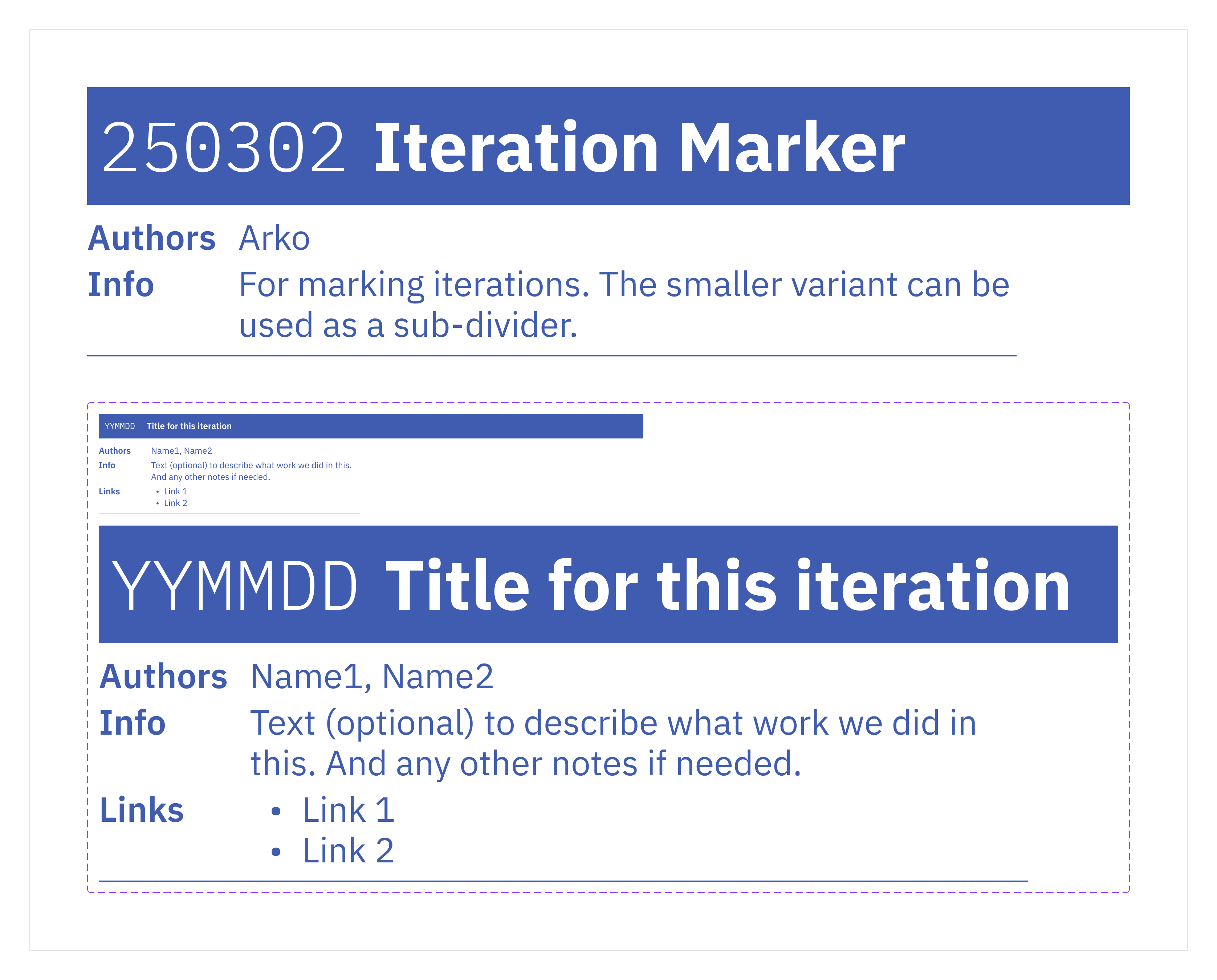
For documentation, I borrowed two utility components from Shobhan, a former colleague and mentor—an Annotation and an Iteration Marker. Most thinking during design gets lost; these turn loose notes into visible blobs that carry thought, timeline, and ownership.
For versioning, we settled on a dot-prefix convention: append the deprecation date to a component’s name, prefix the layer with a dot, unpublish on the next Library update. When the Icon component matured and the Button needed a refit, we could swap it mid-build without touching anything already shipped.
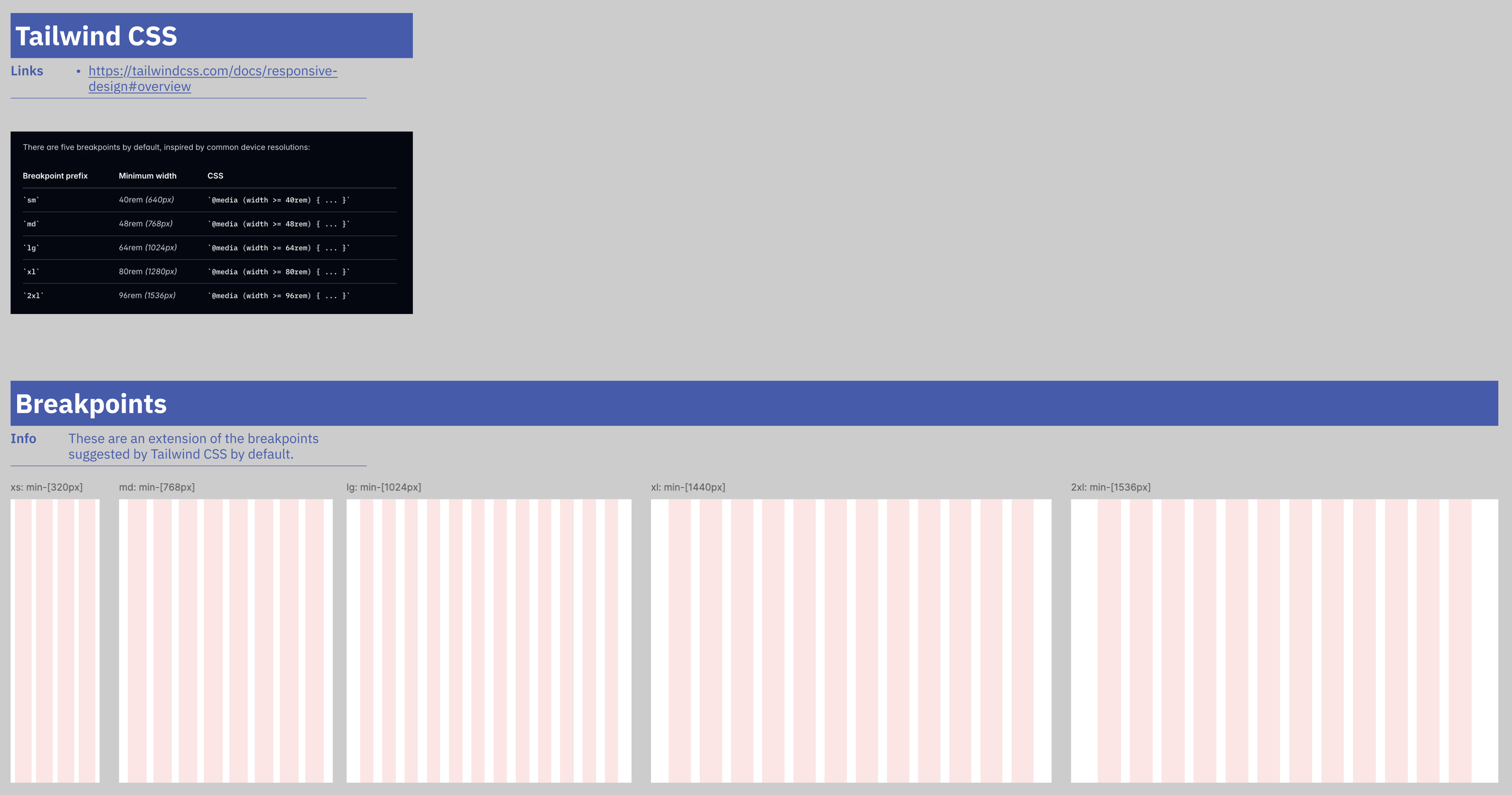
For layout, we aligned breakpoints to Tailwind’s defaults and ran pages on a fluid column grid. Designers and developers would reason from the same widths.
Inside the library
Documenting design
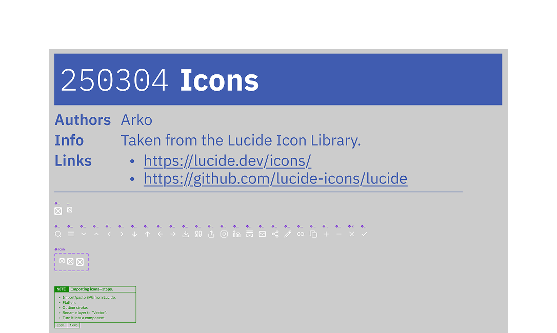
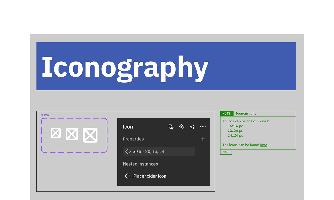
Iconography & colour
Lucide for iconography—clean, cohesive, customisable. I’d used it on a prior web project and it handled an editorial site’s range well. Rather than pull the full set in upfront, I set up a component pattern teammates could extend as new icons surfaced.
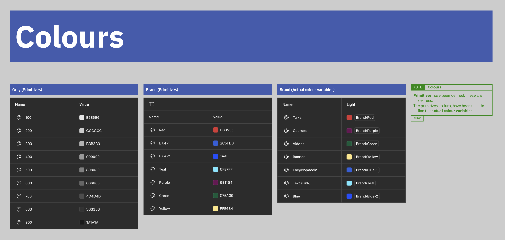
Colour split in two: primitives (raw hex) feeding tokens (semantic use).
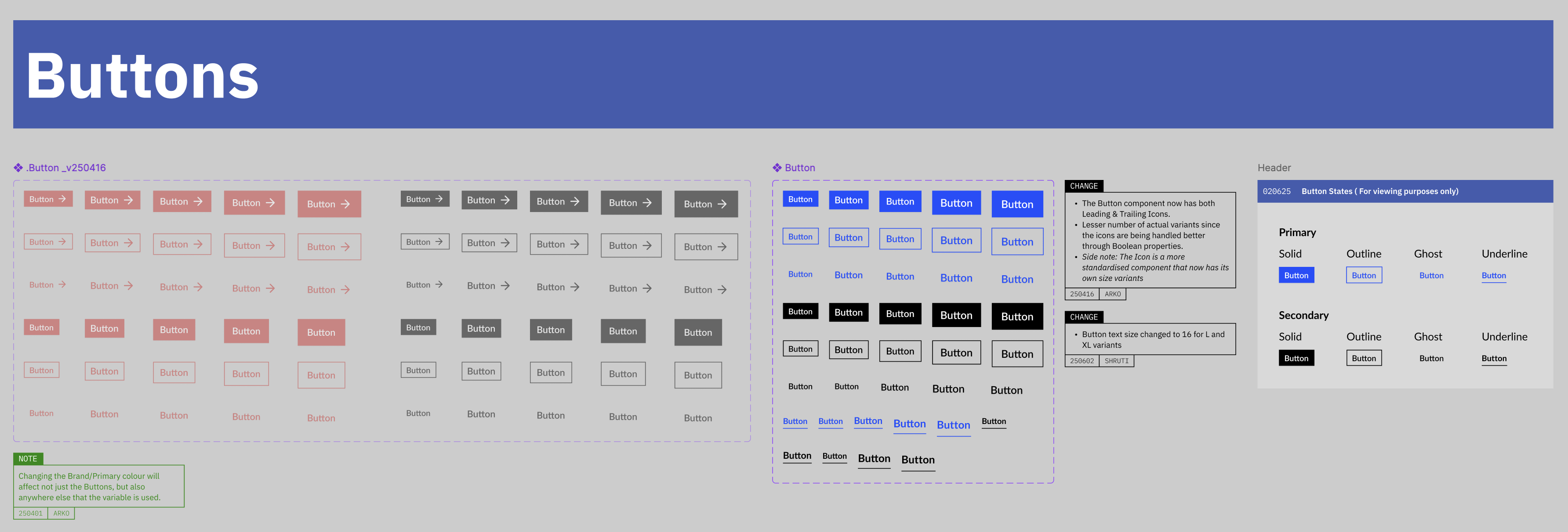
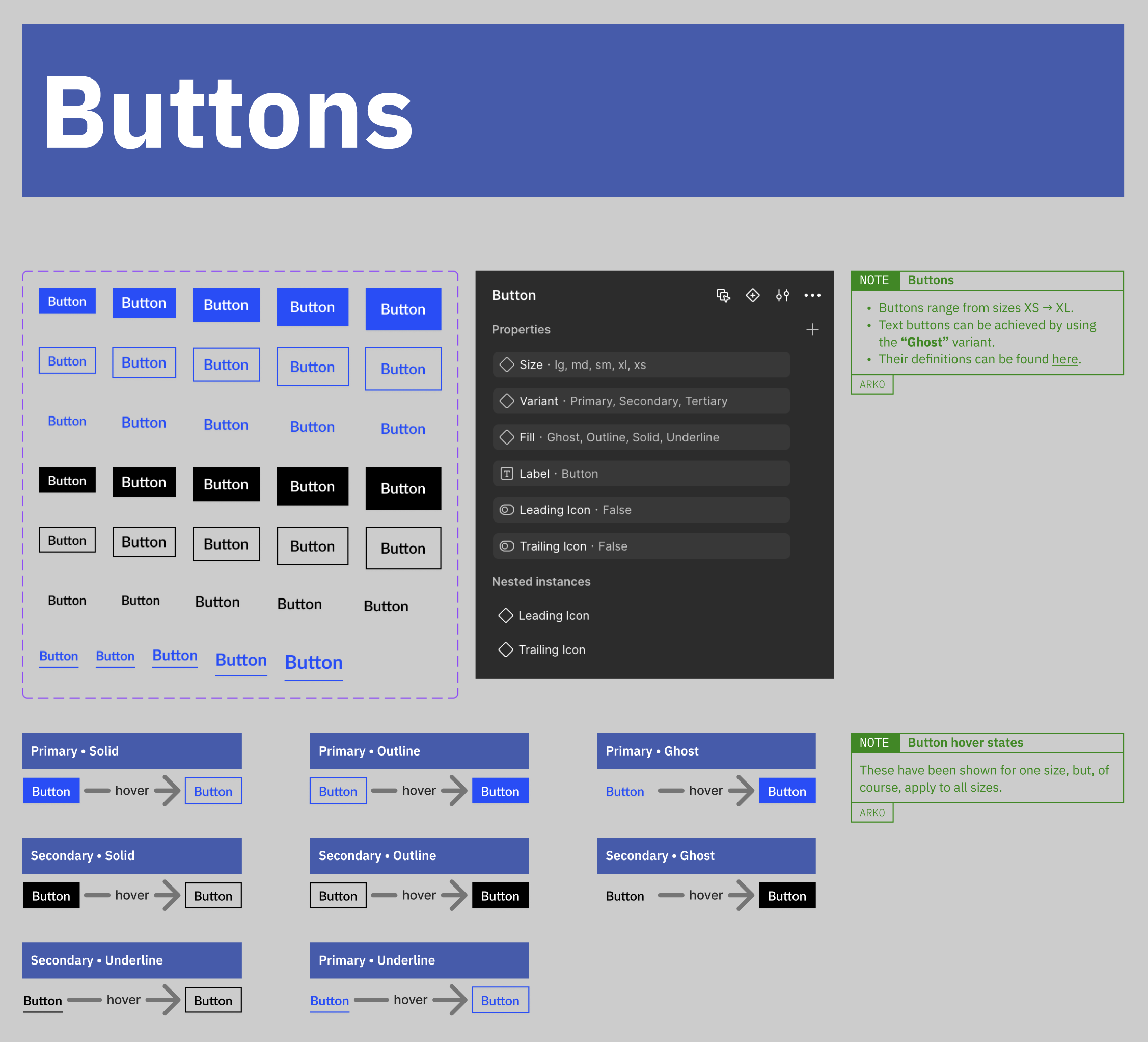
Components
Buttons arrived as a small zoo: several variants doing similar work. We consolidated, then versioned the old one out when the Icon component forced a refit.
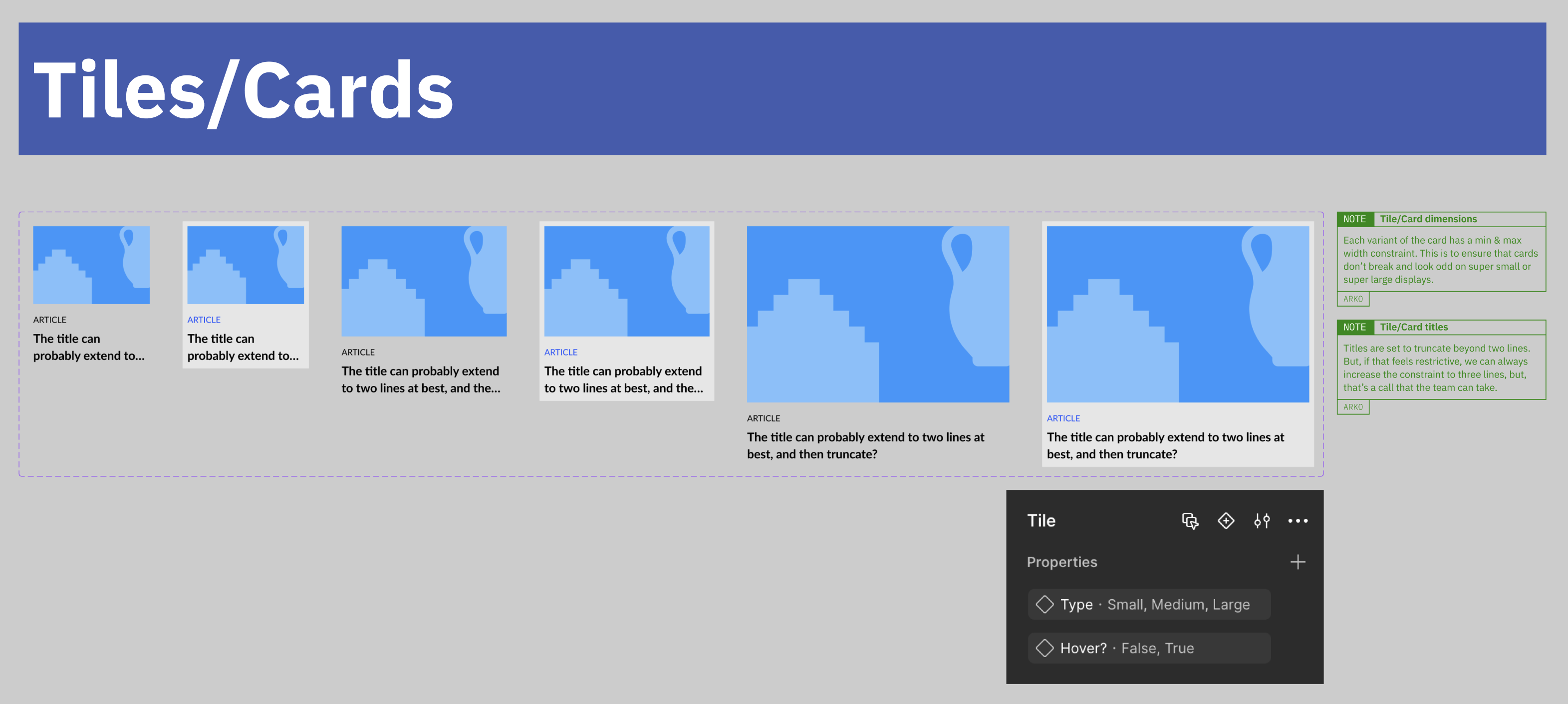
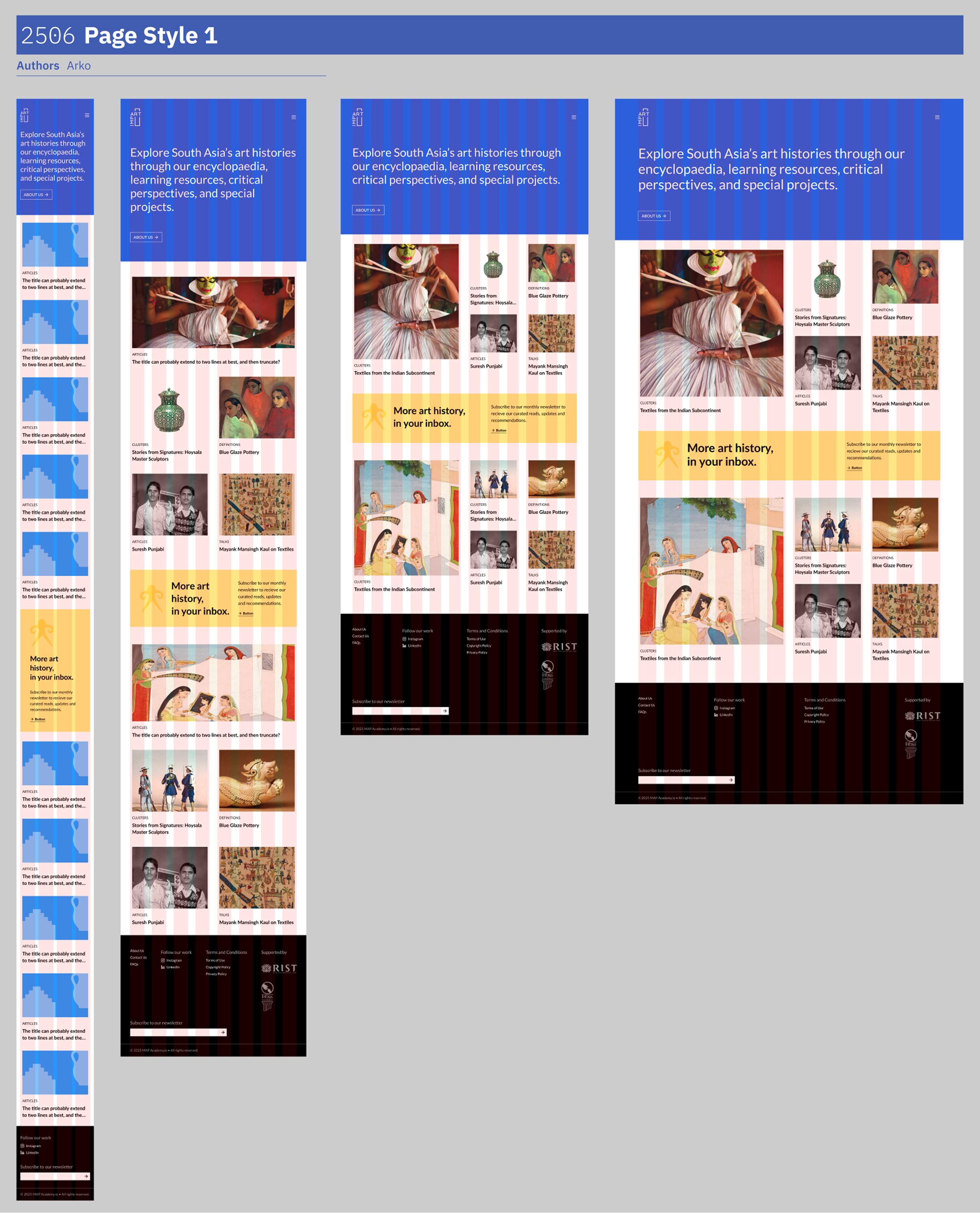
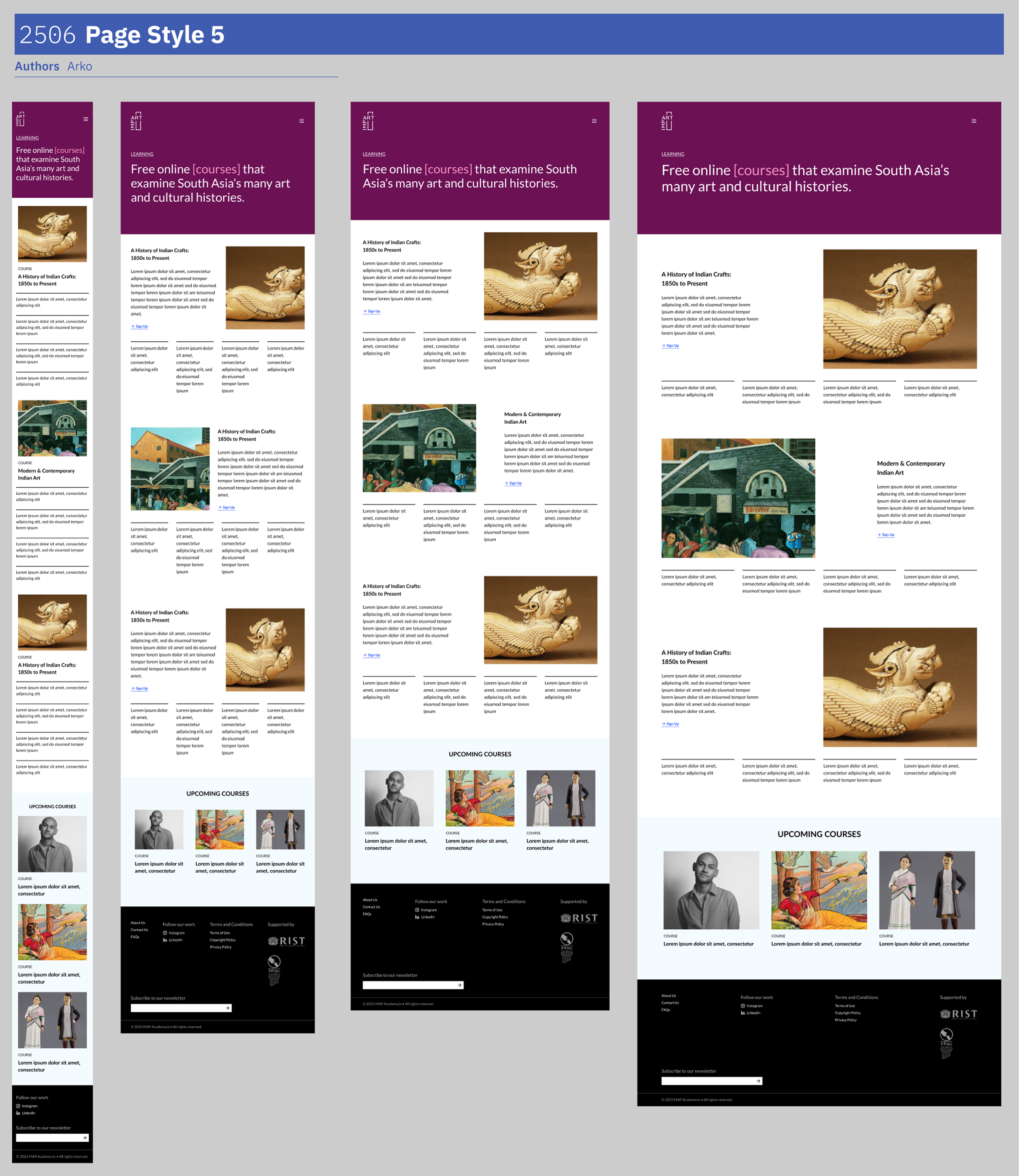
The Card carried explicit rules for font-size, height, width, and truncation—standalone images and image-inside-card layouts, nothing breaking at the edges of the range.
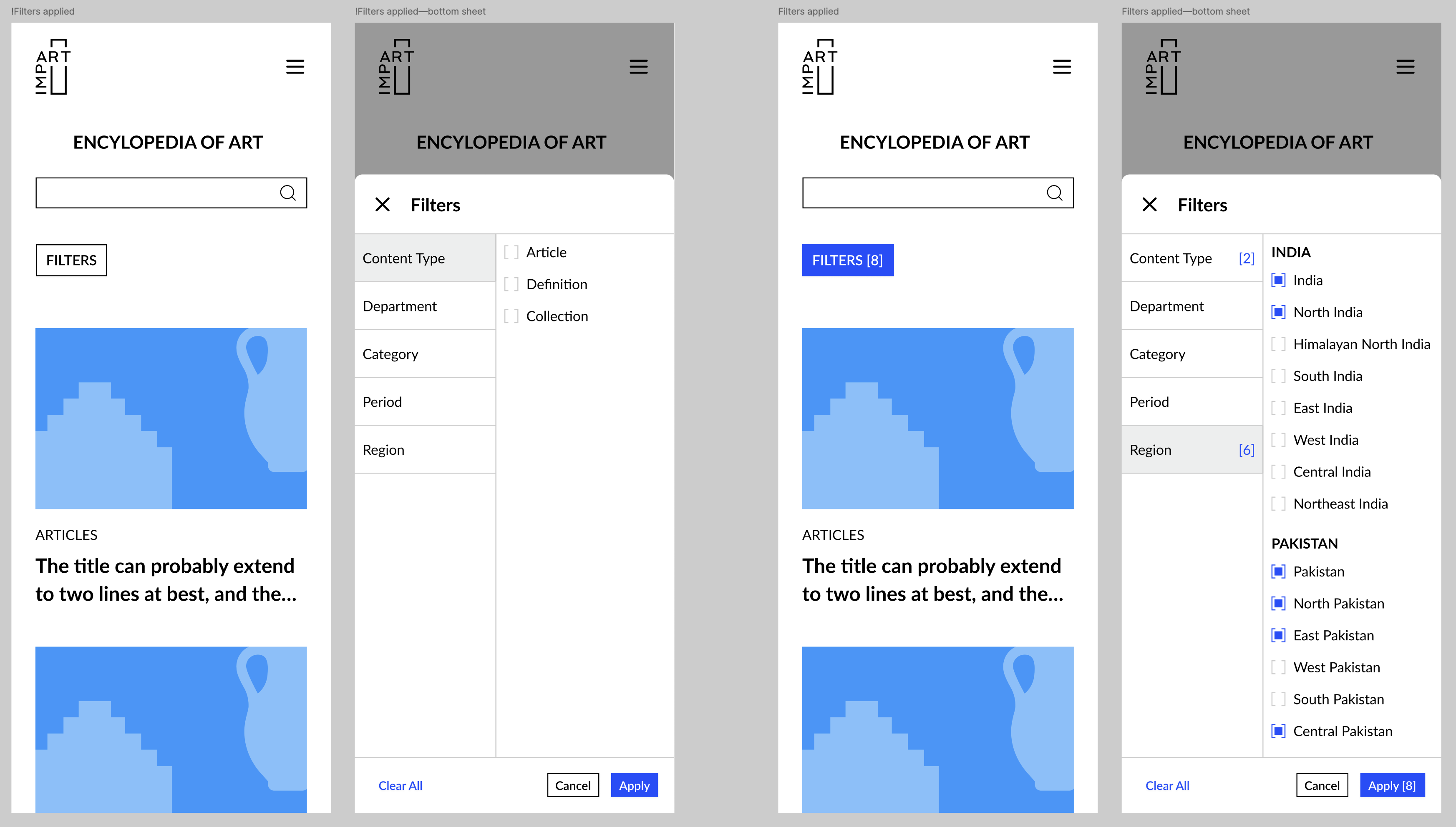
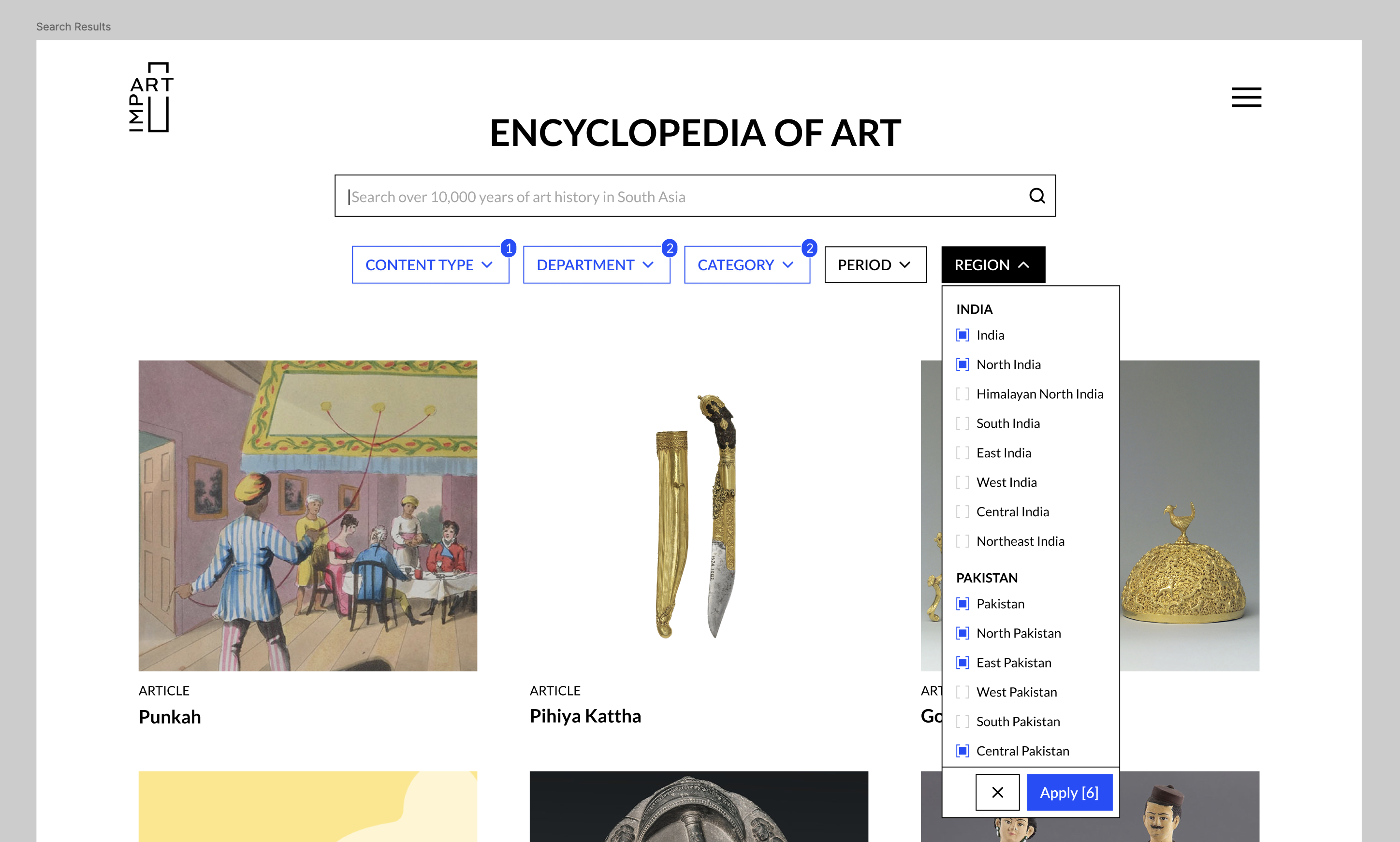
Filters had to feel the same on mobile and desktop. We slipped Impart’s broken-rectangle frame into the checkbox—a small brand-recall beat.
Layout & responsiveness
Components were built responsive from the start with Auto-Layouts. Page layouts needed the same discipline—the Tailwind-aligned breakpoint system and fluid column grid from the principles section, applied across the playground where the first cut of all the pages came together.
Interaction prototype
The homepage hero surfaces four offerings: encyclopaedia, online courses, critical perspectives, and special projects. Each phrase links to its page. On hover the word shifts to cyan and picks up L-shaped corners—the same broken-rectangle frame as the Impart logo, not literal bracket characters in the type.
I built a small HTML prototype for the team to try. An early version let those corners take up space in the line. Commas moved and line breaks shifted on every hover. I proposed holding the paragraph still instead: corners sit outside the text flow, and the comma or full stop after a phrase turns transparent on hover so the closing corner has clearance without reflow—the punctuation stays in the layout, just not visible for a moment.
What shipped
By July, the library held 25+ components, all carrying annotations for the dev team to hand off against. The dot-prefix convention had already proved itself—we replaced the Button mid-build without breaking shipped pages.
Shruti’s patience and openness through every revision is what made the system land the way it did.
It was a pleasure working with Arko to develop the design system for Impart’s new website. Arko is a thoughtful, detail-oriented, and reliable collaborator who understands the scope of work and consistently delivers as promised. I really valued the opportunity to learn with him—especially when it came to building future-proof design systems. Shruti Singh