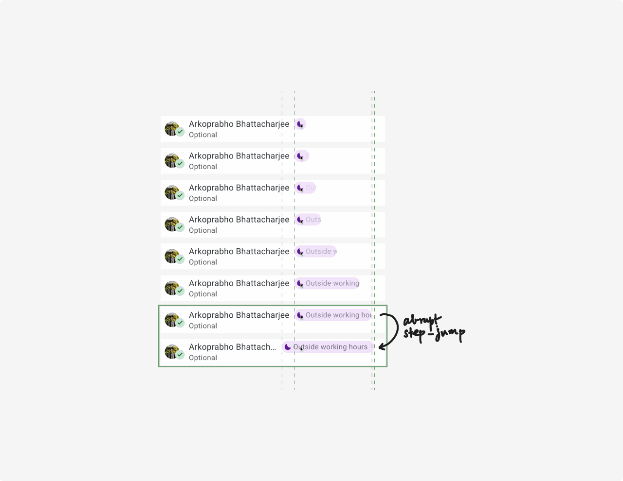
i noticed something about the micro-interaction associated with the
 out of
office
/
out of
office
/  outside working hours
indicators in google calendar.
outside working hours
indicators in google calendar.
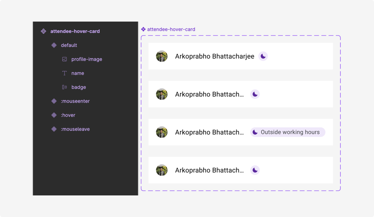
on hovering over the indicator, specifically, when there's
limited space for the indicator to expand on hover, the interaction feels somewhat abrupt.
when the indicator doesn’t have enough room to fully grow, it tries to expand as much as possible,
into the available space on the right. however, once it reaches that limit, it suddenly stretches
the remaining portion from its center, but asymmetrically — creating a jarring effect.
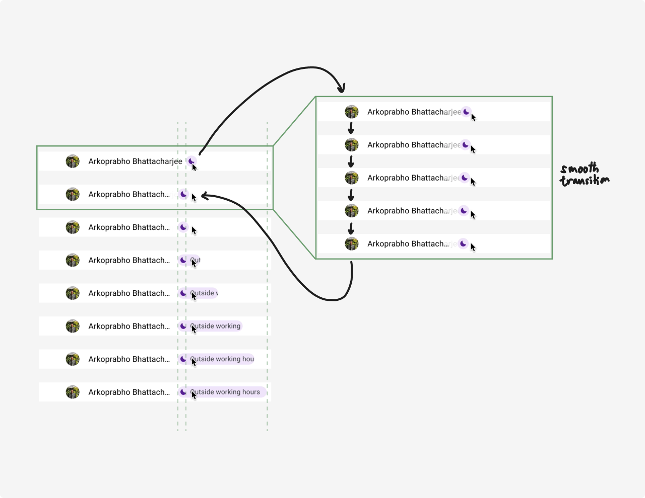
a smoother approach could have been — the indicator first shifting slightly to the left, creating
enough room for itself to fully expand into. once it has the space, it could then grow without
causing any abrupt layout changes. this would eliminate the feeling that the indicator is "fighting
for space" and ensure a more seamless, fluid experience.
the proposed transition was prototyped in figma, with the help of Smart animate & Auto layout.