i cut my teeth as a product designer at Aasthy — a fractional real estate investments platform. i
was their first and only design hire for the better part of a year or so. i had the opportunity to
take a stab at everything from brand to product and UI/UX design.
how and why Srinath (a
co-founder) took the leap of faith with me (i was an engineer by training and hadn’t designed a
single product till then) is still baffling, but i will forever be grateful for it.
at aasthy, there was a constant zeal to change the outlook surrounding real estate [as being a shady and scary sector]. the goal was to have people look at real estate through the lens of an investment opportunity and thus have it empower financial growth for them. the lack of availability of accurate numbers and transparent, no-nonsense market analysis has made real estate untrustworthy. so, everything that we did at aasthy, was evaluated for the trust and value that it could bring to the platform and its users.
- visually convey real estate
- exude the idea of wealth, trust, and confidence & stability.
i achieved the former by looking at the most typical shape of a house (which is a triangular roof on a rectangular foundation) and abstracting it into a lockup of triangles. some part of the latter was also achieved by the upward-facing triangles that was representative of growth. some part of the confidence & stability came from the choice of a geometric shape as opposed to a more abstract, organic one; the rest of it was through color.
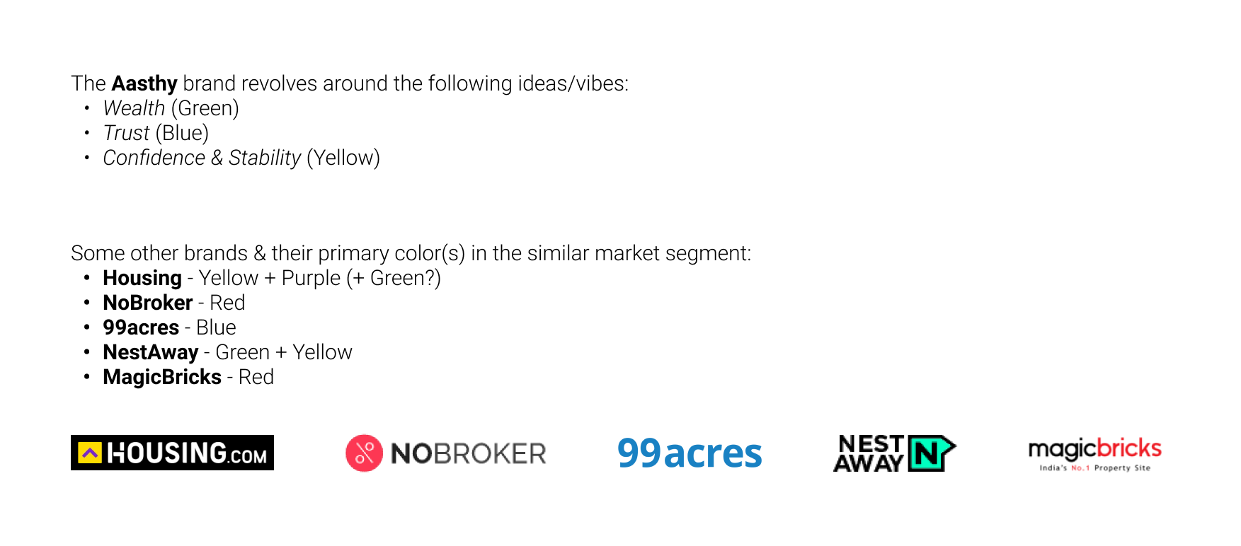
ideation & research for figuring out aasthy's brand colours
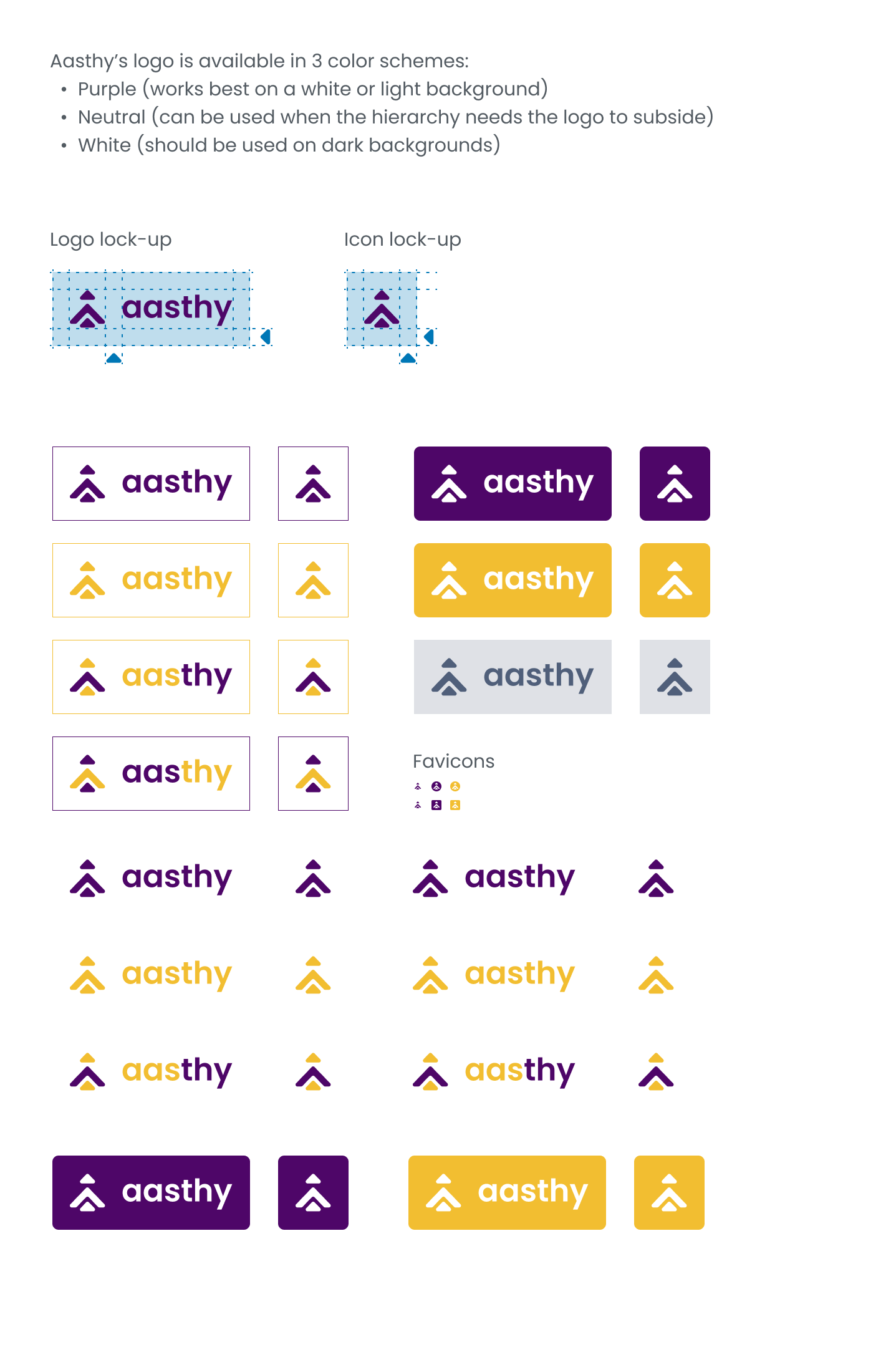
colour & lock-up variations of the logo
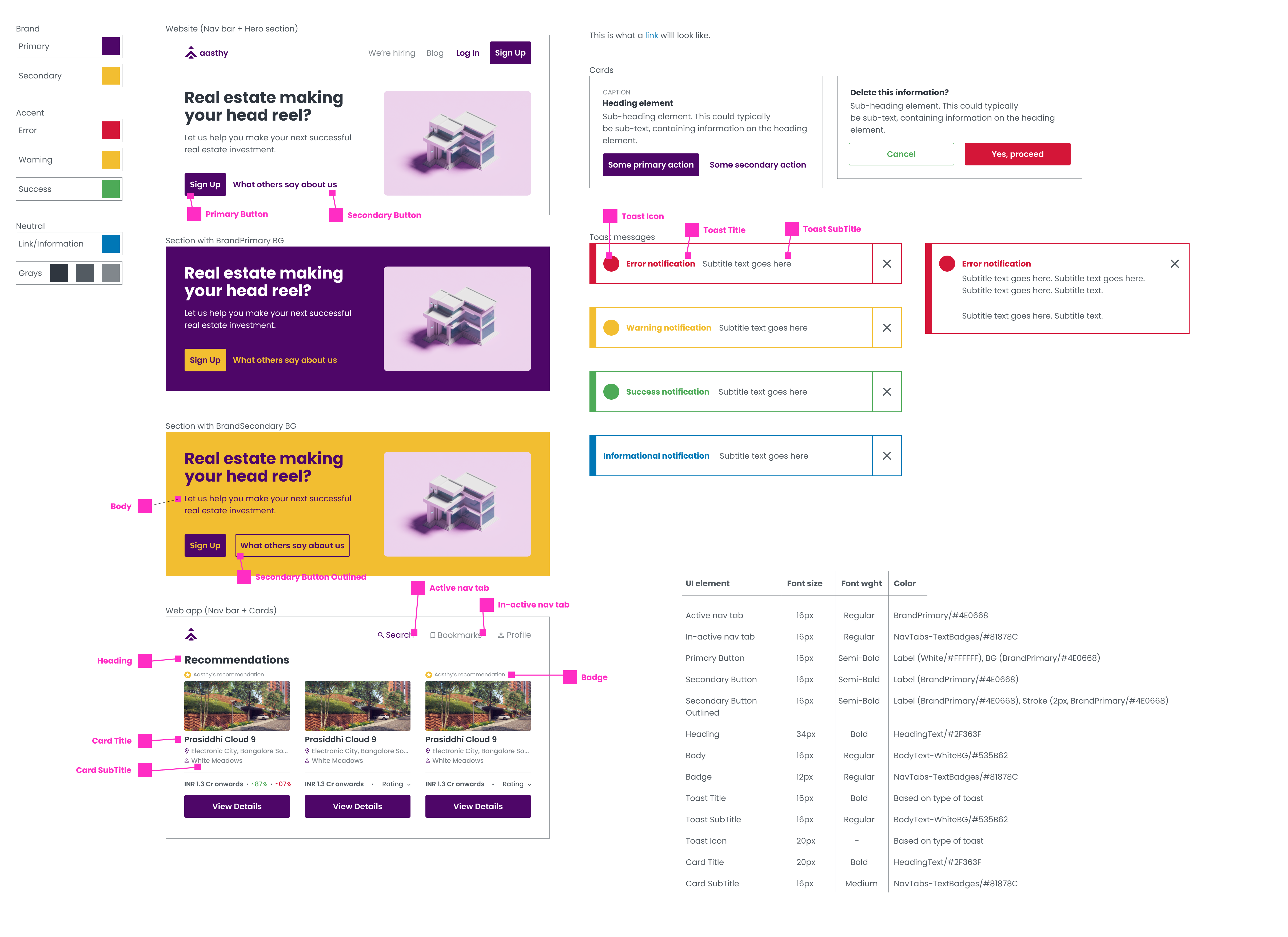
the application of the colours across the webapp/website

an iteration of a landing page
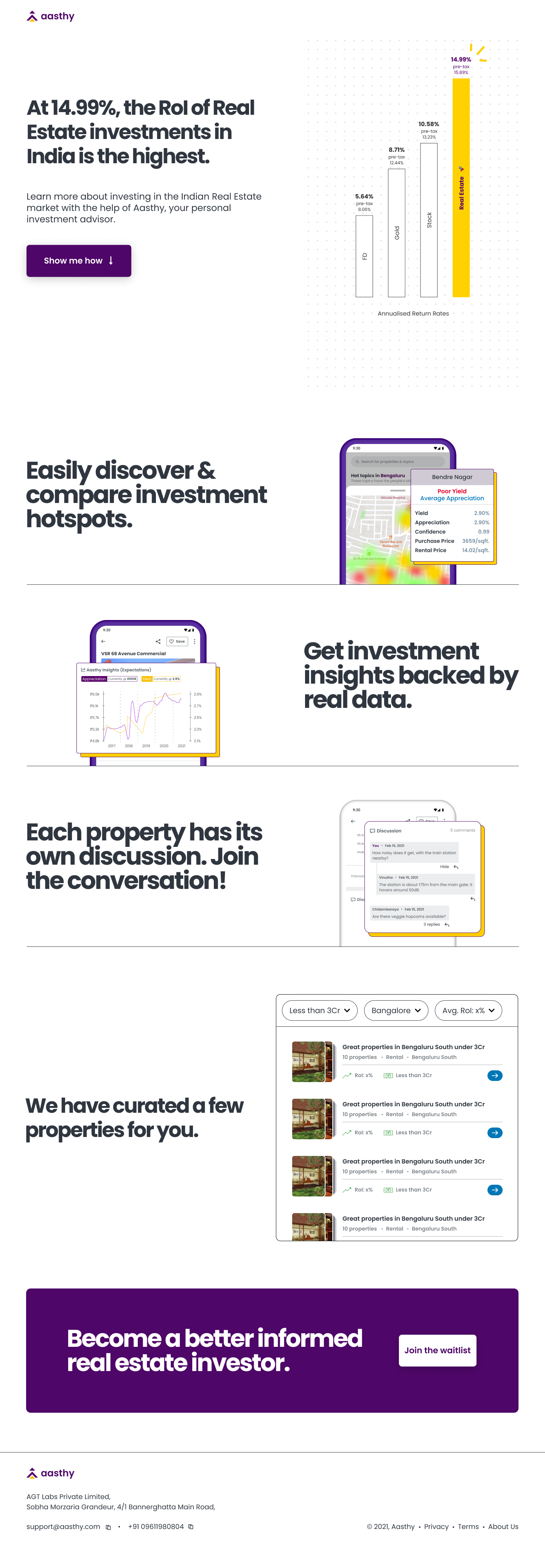
another iteration of a landing page
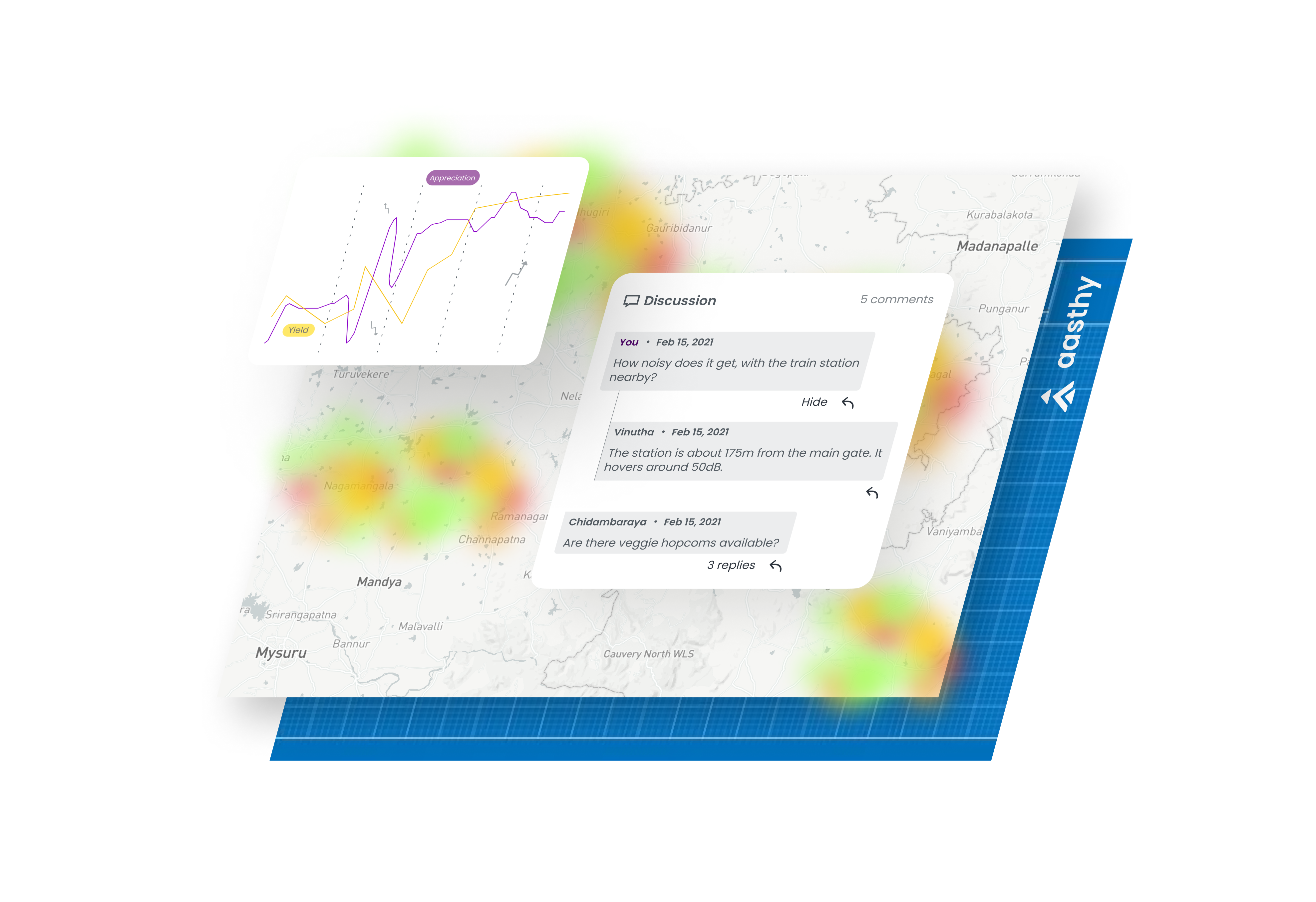
an illustration asset for the site

an iteration of cards for google ads

another iteration of cards for google ads

yet another iteration of cards for google ads
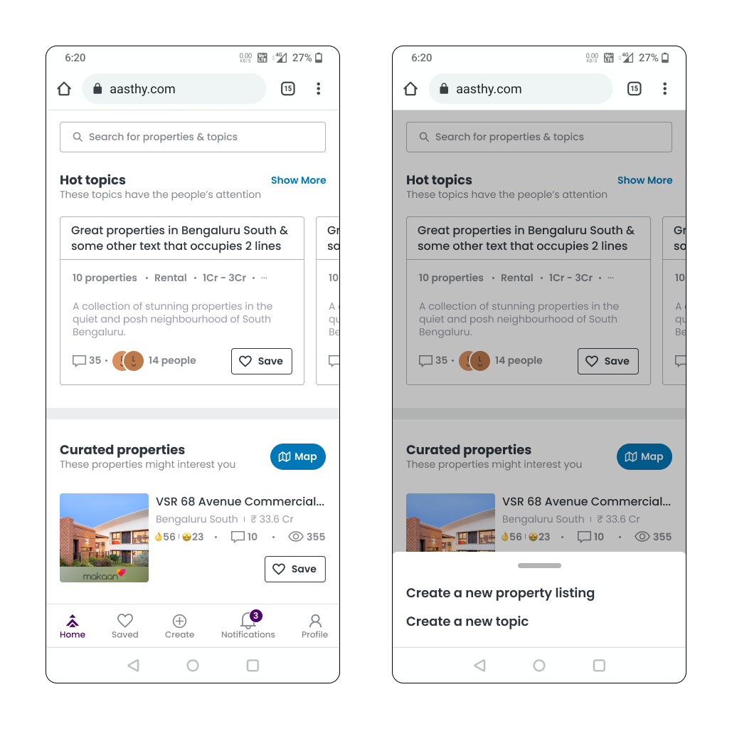
an early iteration of the homescreen of the app
there's just so much more that i'd like to put out here. i'm on it!